Editor Gary Fisketjon launched Vintage Contemporaries, a paperback imprint of Random House, in September 1984. There were seven initial titles. By decade’s end, there would be close to 100. The line was a mix of reprints and originals, and nearly thirty years later the checklist found in the back of the books reads like a ballot for some Cooperstown of late-20th Century fiction.
At the time, however, the series was far more renowned for its design: the checklists, color-banded spines, dot matrix accents, often surreal artwork and equally cryptic colophon.
Many freelance artists provided the cover images—a few with regularity—under the guidance of art directors Judith Loeser and, following Loeser’s death in 1988, Susan Mitchell. The person who came up with the uniform, De Stijl layout, and the one whose name can be found on the back of those hundred or so books—that was Lorraine Louie.
A native of San Francisco, Louie graduated from the California College of Arts and Crafts. For several years she worked in the Bay Area, at that time a hotbed for graphic design. In 1982, at age 26, she moved to New York. After freelancing briefly, she landed the Vintage Contemporaries job through her new boyfriend—soon husband—fellow graphic designer Daniel Pelavin.
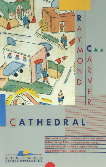
The Vintage Contemporaries design didn’t come quickly. Louie did numerous drafts of the first cover in the series—Raymond Carver’s Cathedral—and, says Pelavin, “took a great deal of pride in the process.”
The series was a critical and commercial success; Bright Lights, Big City sold 300,000 copies in two years, and publishers raced to start their own knock-off imprints. But by the early nineties, personnel and tastes within Vintage Contemporaries had changed and the design was phased out.
Louie would continue to design covers until her death in 1999. Though she revolutionized book design, she never received much fanfare. And according to Pelavin, that was just fine.
“She was never much impressed with fame,” he says. “It was much more important to just do meaningful work.”
To acknowledge Louie’s monumental contribution to design history, and share their thoughts on specific covers as well as the series as a whole, herein are various authors, editors, and artists associated with that era of Vintage Contemporaries.
(Thanks to Daniel Pelavin for many of the images, and to he and Susan Mitchell for providing invaluable insight and context.)
_______________________________________________________________________
What was the motivation for the uniform cover design?
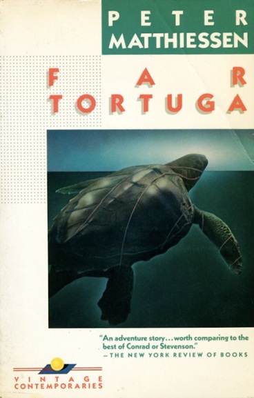
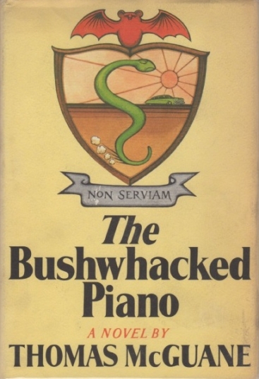
My conviction that publishers paid far too little attention to what’s obviously the most important aspect in presenting a book to a largely disinterested public. Covers simply weren’t a priority, or else were subject to mediocre taste or none at all. Certainly uniform designs were common in Europe by then, and since VC was a new program altogether I wanted people to identify books in a series that included highly regarded writers—Matthiessen, Carver, etc.—with ones unfairly overlooked in my view—McGuane, Crumley—and such newcomers as McInerney and Russo.
And I’d had a happy experience with DeLillo in Vintage, where after publishing two of his books in nearly mass-market editions that really didn’t reflect their content or appeal to their natural audience, I tried again—using an English designer whom I’d met who also designed album covers. They were very striking, highly uniform, and Don’s books, which up to that point hadn’t sold well at all, suddently found a place in the market.
What made a book a candidate for the series? Were you looking for shared themes or comparable writing style or anything else in particular?
Only that is was terrifically good, each in its own way. There was never any notion of identifying a particular school or style of writing, since every great writer sets his or her own standards.
Were there any titles or authors you wanted to get for the series but couldn’t? Cormac McCarthy, for instance—why was only Suttree re-released in the series and not his earlier novels as well?
Renata Adler’s Speedboat was supposed to be on that first list, but she told me she didn’t have anything in common with Carver and McGuane. Indeed, they were better writers. As to Cormac, that’s a long and involved story, but remember that I left the company in 1986 and somebody else started making the decisions. Happily we set that situation right when I moved to Knopf in 1990 and Cormac soon followed.
What are some of your favorite Vintage Contemporaries covers?
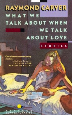
Cathedral, Suttree, The Bushwhacked Piano, and both Bright Lights, Big City and Ransom, perhaps the most handome of them all.
What was Lorraine Louie like to work with?
A complete pleasure—incredibly talented, adventurous, and personable.
—Gary Fisketjon, editor
In 1983, Random House started working on a new paperback series which they were calling Vintage Contemporaries. The late Judy Loeser was the art director who hired the late Lorraine Louie as the freelance designer, who conceived the format and typographic design for this unique series. Judy found a sample of my work wedged behind her desk drawer. She called me the summer of 1983 to come to her office with my portfolio. I guess Judy liked what she saw, because she then set up an appointment for me to show Lorraine Louie my work. They hired me to create the cover images for the first seven books of this new series which was going to launch in September of 1984.
This was my first commission in trade publishing. In my first meeting with the Vintage Contemporaries staff—Loeser, Louie, and Gary Fisketjon, the editor of VC—we talked about the books and the packaging. The discussion centered on how Gary envisioned a whole new approach to paperbacks with innovative design, and marketing. And as was the case with Bright Lights, Big City by Jay McInerney, the idea was to launch some of their authors’ work first in paperback.
That day I was given manuscripts to read for some of the books that were to be published. These included Cathedral by Raymond Carver, The Bushwhacked Piano by Thomas McGuane, and Bright Lights, Big City. The plan was that I was to come back in a few weeks with concepts and thumbnails of cover images for these titles.
Having read the manuscript for Bright Lights, Big City, and the other manuscripts, I met with Judy at her office to discuss my ideas. As it turns out, I actually didn’t have any sketches to show, but we discussed what I was thinking for the image.
I told her I wanted to shoot somewhere downtown, maybe at night, maybe around the Odeon, maybe with a “model” who would represent the character in the book, Jaime. Publishing was so creatively and pleasantly loosey goosey back then. It was before the era of submitting a multitude of comps to marketing people, bookseller representatives, and others, where all the parties express their varied opinions. Judy simply responded to my ideas by saying okay, go for it, try it. She called in Gary and told him my very loose ideas.
A few days later I called up someone I was friends with at the time, Nelson Smith. I felt he could be the Jaime character and I asked him to meet me downtown near Chambers Street at sunset. I arrived with a small portable strobe, a camera, and a vintage overcoat for Nelson to wear. I wanted to capture the moment of Jaime’s anticipation for the long night that lay ahead of him.
We started photographing around the Odeon. The Odeon was practically a character in the book, and in the early 1980’s was a beacon of all that was considered hip in lower Manhattan with it’s retro glowing neon. I felt very much that it should be included in the cover image. The World Trade Center was the perfect anchor for southern Manhattan that announced itself with a giant “ici” on the landscape, in an area which back then was pretty desolate after working hours, but also very sexy at night.
I told Nelson to stand on the north corner of Thomas Street and took a few pictures of him in the foreground with the Odeon in the background. I then swung the camera a little to the right and took some shots of the World Trade Center.
When I processed the film from the shoot, I did not see the image I had been envisioning for the cover. Recently I had started working with a form of collage. I would recompose an image using multiple photographs, which then would be reshot. Next I printed it so that it was all one surface. Then in order to blend and smooth out the different images I slowly worked on it with layers of pencil and airbrush work.
All this was way before the days of Photoshop. So for my idea of the cover image for Bright Lights, Big City, I made three prints: Nelson with his back to the camera, the warm glowing facade of the Odeon, and the icily lit World Trade Center. I cut out the three components, got rid of any extraneous cityscape that was in the background, blended everything in, and essentially made a small stage for Jaime, the Odeon, and the World Trade Center. That’s it.
Eight years later I moved three blocks north from the exact location I had photographed for the Bright Lights, Big City cover. The World Trade Center filled my front window. I would never have imagined that of the three components of that iconic cover, the towers would be the first to vanish.
—Marc Tauss, artist
Vintage Contemporaries was started by Gary Fisketjon, my classmate at Williams. We tended to share books and literary discoveries at Williams, and when I finished my first novel naturally I showed it to him first. He wanted an original novel to go along with the repints for his new series. I was reluctant at first because I wanted a hardcover publication but he convinced me.
I loved the Vintage Contemporaries design. My first thought was that the books looked like albums—this was in the days of LPs—and that seemed a good thing, since Gary was trying to appeal to a younger audience. No other books on the market looked like that. And I thought the cover image for Bright Lights was absolutely emblematic of the book. It was incredibly evocative and haunting.
I didn’t really have any input on the design. Ditto for the other books. I’m not a visual artist, and I was happy that someone was able to come up with such strong packages for the books. I particularly liked Ransom. It’s a beautiful cover.
Vintage Contemporaries was a big hit and it spawned a host of imitators. It was really about Gary’s taste, to a certain extent, which was pretty much my taste. It gave certain books a second chance, books that perhaps hadn’t been well published the first time, as well as a format for publishing new writers who deserved attention.
Nothing is as exciting as seeing your first book cover, but I think I’ve been well served by my book designers, and I think that Vintage Contemporaries could be viewed as the beginning of a golden age of book cover design.
—Jay McInerney, author
I’m sure I was delighted on first seeing the Vintage jacket for The Bushwhacked Piano. The Simon and Schuster hardcover jacket was undistinguished. The Vintage jacket was entirely in the spirit of the book, a fair introduction to the book and was, I have heard, the reason a number people bought it. It really attempted to take on the book itself and reimagine it graphically.
Yes, there was a kind of family feeling among the authors. Some, like Raymond Carver, Richard Ford, Joy Williams, and Jay McInerney, were or are friends and perhaps the imprint had something to do with that, the sense of being in an ensemble meant to produce something with object value as well as, or even part of, literary content.
I think Gary Fisketjon at Knopf must have been the key to these relationships. He was in at the beginning of the imprint, already editing some of the writers, and eventually editing me. He is an outstanding editor and has always had a sharp eye for emerging writers.
I think serious fiction writers of that era loomed a bit larger for publishers. Nowadays, strictly literary writers without the prospects of large sales tend to get a stock photograph with unusual title-author graphics.
—Thomas McGuane, author
Ray returned east for the launch of Vintage Contemporaries. Lorraine Louie’s design for Cathedral became the prototype for the entire VC line. Uniform spines with bold lettering (C A R V E R in white against a red field) invited buyers to collect these books and display them on their shelves. An illustration for the 1984 edition conveyed the surreal and dangerous psychology of Carver’s prose: the head of a peacock whose fierce red eye and iridescent feathers belied the trim Victorian house behind it. A grid of pixels on each volume alluded to the comics: Roy Lichtenstein paintings for readers.
Fisketjon rolled out his series with dinners and nightclub parties and a major sales push. Vintage Contemporaries filled Manhattan bookstore windows. There were sidewalk sandwich boards, posters, and display bins. For Ray, the rollout began with a dinner at Café de Bruxelles, where he shared a big table with VC authors Crumley, McInerney, and McGuane, and editor Tom Jenks. After dinner, as the rest of the “distinctly male crowd” prepared to move on to a nightclub, “Ray, amid teasing about running off somewhere to see a woman, put himself in a taxi and headed for his hotel room alone….there was no doubt he meant to keep himself out of trouble,” Jenks said. Indeed, Ray did have a date with a woman—he and Tess had a standing arrangement to telephone each other at ten on evenings when they were apart. Still, Jenks noticed, Ray “was fair game for the friendly taunts that followed him into the cab.”
—from Raymond Carver: A Writer’s Life by Carol Skelnicka
The cover of my book Bop, which was a reprint of the book previously published by Coffee House Press, is a similar but more descriptive design of the title story in the book in which a Russian immigrant finds a baby at the beach. The lovely image, which shows a baby in this setting, was simply presented to me when Vintage took on the book. I was delighted with its general theme (though seals would not be at a Chicago beach) and very pleased to be in the Vintage series.
—Maxine Chernoff, author
I had been a studio illustrator for several years and had just begun my freelance career. I had an agent in Atlanta who was bringing in some good work for advertising agencies and local publishers, but I hadn’t broken into the New York publishing market at that time. Then my Atlanta rep teamed up with Tricia Weber in New York. She began calling on the big houses in town, and the book jobs started trickling in from Bantam, Simon & Schuster, Dell, Random House, Avon, etc. Mostly murder mysteries and mass-market adult contemporary titles, with a few hardcovers and bestsellers thrown in.
Tricia called and said that a new imprint from Random House called Vintage Contemporaries was launching and they were in the process of branding the line. They were looking for something a little edgy, leaning toward surrealism, with a crisp, saturated vibe, as I recall. My work at the time was done with acrylics, mostly airbrush, and was described as “stylized realism,” which I guess was pretty accurate; I like highly rendered work, but never tried to be “photographic” with it. I had been a photographer for a while and never had any interest in trying to copy what the camera could see.
So, the art director at Vintage, Judith Loeser, contacted me through Tricia Weber, and wanted me to do one cover as a test piece to see if my style would be a good fit for the line. They sent me a manuscript of Jay McInerney’s Ransom, which I read and enjoyed tremendously. It is a real pleasure working on literature that you find engaging, and most of the books from Vintage fall into that category (unlike many books I’ve done covers for). I drew up my ideas which were approved, and then I did the painting and shipped it to New York. They liked the piece, and it sort of established the look of the Vintage Contemporaries imprint for several years.
I wasn’t the only artist that worked on the VC books, but I did quite a few. I’ll have to go back into my old files and tally them up someday. I was doing what seemed like almost one a month for several years.
Judith would send a manuscript via FedEx, and I would read it and take notes as I read, jotting down ideas for images that resonated with me either on an emotional level, or something that I just thought would make an interesting picture. I would then develop a handful of thumbnail sketches, usually three to five rough ideas, and fax them to the art director.
Lorraine was the designer; she developed that amazing, iconic grid with the dots and the square graphic that is so recognizable. She chose the typefaces and established the look of the line. But once that master design was established, she was no longer actively involved with the artists or photographers who created the imagery on the covers. That was all done with the art directors, and they were very much involved with the process.
I worked with the AD at every step. We would then discuss the sketches over the phone, I would revise and refine the strongest idea, fax that up, and if approved, would move on to the painting. The whole process, from reading the manuscript to shipping the artwork, was usually about two weeks. The paintings weren’t large, about 15″ square, but were quite detailed and took some time to paint.
The most challenging were the books that were not one novel but a collection of short stories, of which there were several. They were also the most fun to work on, because I could take elements from several different stories and cobble them together into my own fantasy scenario.
Bop is one of my favorites, both because it was a book of short stories and the imagery was fun to work with, but also because the little boy in the scene is my son. In the painting he was under two years old, and he is now in college, so it’s nice to see that piece and remember him as a baby. The painting is hanging in my in-laws home, and they cherish it tremendously.
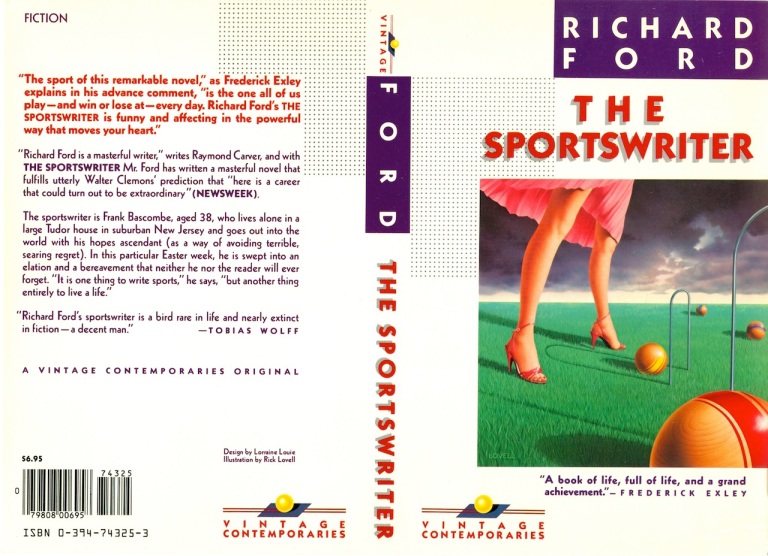
The Sportswriter, by Richard Ford, was a great piece to work on. It was years ago, but I remember the feeling of longing and disconnectedness that the main character, Frank Bascombe, seemed to be feeling in the story. He was a family man at heart who had recently lost his son, was divorced, and was in a transitional phase in his life. The image that came to mind was one of distance; an unsettled, stormy sky; and an undertone of soft-core sex. Combine that with the notion of family and sports, and I came up with the game of croquet, which combines both.
My initial sketch (and I can’t recall whether I sent this idea to Judith or not) was to have two croquet balls nestled at the base of the croquet hoop, to pretty blatantly depict an erect penis pointing up the skirt of the female figure. At any rate, one ball was moved to make that reference a bit less obvious. The hint of it was still there, and the feeling of emptiness and longing came through pretty well, I think.
Vintage Contemporaries really got it right, from Lorraine’s gorgeous design, to the entire branding of the line, to the brilliant art direction, all of it. The books were well-written and meaningful pieces of literature, and the packaging was spot on. The art directors were always great; they encouraged creative thinking and placed great value on our ability to interpret the work, respond to it in the most genuine way, and put down our vision of the work in a painting that was meaningful to us and that resonated with the readers as well.
Today, at least in my experience, it’s mostly about tricky typography, stock photography, and heavy-handed art direction. The last several titles I’ve worked on (for publishers other than Vintage) were so heavily art directed that all I had to do was essentially clean up the art director’s comp. No reading of manuscripts, no intellectual input from the artist at all.
The current state of book cover design and illustration is dismal at best, and has taken the creative process out of the hands of trained artists and designers and put it in the hands of focus groups who have no clue about good design and good storytelling through illustration. Many of the young art directors don’t understand the value of allowing illustrators to actually think; they see illustrators as hands for hire, not artists who can bring a level of creativity and sophistication to the work that a focus group, sales staff, or editor could never do. It’s all about cost cutting and maximizing sales at the expense of the cover.
—Rick Lovell, artist
As always, I’m out of step with the proposed jackets for my books. I know perfectly well what I don’t approve of (everything), but haven’t the slightest clue about what should appear on the front of the novel I’ve just, after all, finished writing.
So, with that said, the jacket on The Sporstwriter was simply splendid. It was among the first batch of VCs, and the series’ “look” was a work in progress—following upon McInerney’s great success with Bright Lights, Big City. I frankly don’t very well remember the cogitations that went on. But I remember that I thought—typical of me—that the image of the croquet balls and wickets seemed distracting, since they were but a small detail in the novel. The legs and the wind-blown skirt I did like (at least as a concept), because I thought they were sexy (the legs were actually a drawing of Amanda Urban’s legs taken from a photograph). The purple, bruised-up clouds, the matte of green lawn were things I didn’t see ’til the whole was composed.
But as I said, the whole was a happy miracle that Lorraine and Rick Lovell figured out. It’s vivid; the colors are arresting, the imagery is slightly surreal and dreamlike, but it still manages to draw themes from the book without actually portraying the story.
In other words, the art on the front manages to be somewhat abstracted, attractive, and somewhat mysterious, and also unified—all at once. I’d guess that’s about at good as a jacket can be, in my estimation.
—Richard Ford, author
My agent, Amanda Urban, was excited about the story collection Taking Care being reprinted as a Vintage Contemporaries—in print forever! And I think the cover—a white rabbit in the foreground of a snow-covered palm tree—was extraordinary, the most striking in the series in my opinion. Many of the stories took place in Florida, and the snowshoe hare was a soulful symbol in the title story. The designer Lorraine Louie and artist Rick Lovell captured the calm but disassociative way the stories made their connections. I find the cover timeless and elegant.
—Joy Williams, author
In 1985, at the tenth anniversary of the Vietnam War, I began to write a novel that dealt with my own experience of the war from a coming-of-age, home-front perspective. The working title was Body Count, because every night the television news would report the daily body toll, usually around fifty soldiers. But that title was already taken, so I changed it to Saigon, Illinois. The building of the Vietnam Memorial in 1982 had put the painful subject of the war back into discussion. I was also impacted by the novels of my office mate, Larry Heinemann, Close Quarters (1977) and Paco’s Story, which received the National Book Award in 1986.
I had been a Conscientious Objector during the Vietnam War, working at Chicago Wesleyan Memorial Hospital, 1968-1970. The novel reflects some of my own experiences there.
When the manuscript was finished after five months of writing, I sent Chapter 13 to Veronica Geng, fiction editor at The New Yorker, at Larry’s suggestion. At the same time, I sent the full manuscript to Pat Mulcahy at Vintage Contemporaries, the series that had created such a sensation with Jay McInerney’s Bright Lights, Big City. This was done on the advice of Maxine Chernoff, whose book of short stories, Bop, was in the process of being reprinted by the series after receiving a rave review by Francine Prose in the New York Times Book Review.
Two weeks later, Geng accepted the story for publication, and I was paid a dollar a word ($5,290). On that news, Vintage accepted the novel the following day. A paperback original, it was in print for eight years.
This development changed my profile for a while, because I was known as a poet. After writing a book-length poem, The Novel: A Poem (New Directions, 1990), I wrote a second novel, December. It was a sustained, comical meditation by a scholar and “close thinker” on his family life at Christmas time. Farrar, Straus Senior Editor John Glusman wanted to publish it. However, he was not supported by the other editors, and the manuscript was returned. I was eager to return to poetry, so I put the drafts of December into a drawer and moved on.
I had no impact on the design of the book’s cover, but I liked its clarity and force very much when the book appeared. The eye-catching detail is of a hospital bed floating against a dark blue sky, above a road that splits into three: the fictional Malta, Indiana, on the left; Chicago straight ahead; and Saigon on the right. The story, of course, is set in Chicago. On the bed, completely covered by a U.S. flag, is a dead body.
The book’s type elements, on both the front and back covers, are vivid and impossible to misread. They include the story’s opening sentences: “You can call me Holder. It’s one of your basic names, like Gold, Paper, and Anxious. Most of us belong to the Church of Peace, which is German Protestant—Midwestern and Rural. We refuse to kill anyone with a gun, or with anything else other than good intentions.”
—Paul Hoover, author
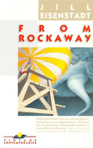
From Rockaway was originally published in hardcover by Knopf then quickly thereafter in paperback by Vintage Contemporaries.
At first the cover surprised me. There is only one mention of a tornado in the book, and it does not occur in Rockaway. But pretty quickly I loved how the well the image captured a sense of menace and uncertainty lurking on a perfect beach day.
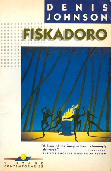
Vintage Contemporaries was the beginning of the literary paperback. It was exciting to be part of something new and even more so to be alongside some of my idols like Raymond Carver, Denis Johnson, and Richard Ford.
That said, the book is now out of print, so…
—Jill Eisenstadt, author
The hardcover editions of both Days Between Stations and Rubicon Beach were published by an imprint of Simon & Schuster called Poseidon, which didn’t have its own paperback line. Another editor who had read Days Between Stations when it was first circulating had since moved over to Vintage and still had interest in the book. It was pretty serendipitous, a lot of circumstances aligning.
It was a very hip line, with all the good and bad associations that go with that, and I didn’t think of myself as a particularly hip writer. The keynote Vintage title, of course, was Jay McInerney’s Bright Lights, Big City, which preceded Days Between Stations by two or three years, and Jay helped put Vintage on the map and maybe a little bit vice-versa—in any case, it was a perfect marriage of novel and design. I think among the titles that Vintage was publishing then, my novels may have been something of an aberration—nonetheless, I assume that the upside far outweighed any downside of being on Vintage Contemporaries, and I’m sure my book got attention it wouldn’t have otherwise gotten.
Authors don’t have a lot of perspective on their own jackets. I’ve seen jackets of other authors’ books that I thought were very nice that the author in question hated. My book covers have been highly variable, in my opinion. You can tell when an artist has been inspired, and as a rule, more often than not, the simpler, the better. I’ve tended to like the paperback covers more than the hardcovers, because I have a distinct sense that in many of those cases the artists have actually read the books, which I don’t believe is necessarily true with the hardcovers.
I loved those Vintage Contemporaries covers, particularly after really not loving the hardcover jackets. It’s hard to distill a novel down to a emblematic image, and the kind of novels I write don’t make it easier, but these were as perfect as if the artist had extracted the images from my own brain, especially the first one. That Days Between Stations illustration got picked up by many of the foreign editions, and also has been published with other pieces that have nothing to do with the book (which I assume was the artist’s choice and prerogative).
As to whether I had any input in the designs, I want to say yes but I don’t trust my memory on this. Again, it may be a testament to the artist’s interpretations that they were so apt it just feels as though I must have thought of them first.
—Steve Erickson, author
My entire experience with Vintage Contemporaries spoiled me. Bright Lights, Big City had electrified the once staid world of book publishing, and my first novel was about to become a part of the same family.
It’s a difficult novel to encapsulate in a cover but Lorraine Louie and artist Rick Lovell delighted me. There is so much information in the image, such a strong, surreal portrait of a nerd. The WWII fighter plane crashing into the window is an image from the book, and the looming image of Dorothy in the window seems right out of the fevered imagination of my teenaged protagonist.
I don’t remember much revising at all. Even the text on the computer screen—”Hey, don’t sweat it, Earle.”—came from Rick, not from my book. He and Lorraine added more to my book than any other designer since.
—Trey Ellis, author
I did those covers for Vintage many years ago so it’s hard to recollect specific instances, and I don’t remember ever meeting Lorraine Louie. My contact, as I recall, was Judy Loeser, who was the art director.
I knew Judy through a mutual friend—Jeff Rund—who was a collector of illustrations living in New York. He came to visit me when I lived in the South of England and bought several paintings from me. When I visited him in New York, he took me to meet Judy at Random House, and that started a relationship that led to some very interesting commissions for me.
The covers tended to have a narrative content, and Judy was open to interesting ideas with very unintrusive typography—almost unheard of for me at that time producing mass-market paperback covers for the UK market.
According to my database, which is incomplete, I did seven Vintage Contemporaries covers.
They were all a pleasure to do, being given a great deal of artistic freedom to introduce a more subtle narrative into the image rather than the high impact stuff demanded by the UK publishing world at that time, and also a nice departure from the science fiction that I am most recognised for.
The only cover that I was slightly disappointed with was Ellen Foster, for which I had a nice idea which was rejected in favour of a different solution.
The story was about the thoughts of a young girl as she watched her grandmother dying in bed. The covers of the bed reminded her of the waves in the sea. The final cover worked well, I thought, but I didn’t think that the idea was as strong. The notion of death being like a sand sculpture slowly dissolving struck me as a rather poetic way of describing the event, which after all was what the story was about. It’s not my job to decide these things!
—Chris Moore, artist
I was the editor of the series for eighteen months in 1986/87. My tenure was short because it was a time of great upheaval in Random House at large. After working for five bosses in eighteen months, I had had enough.
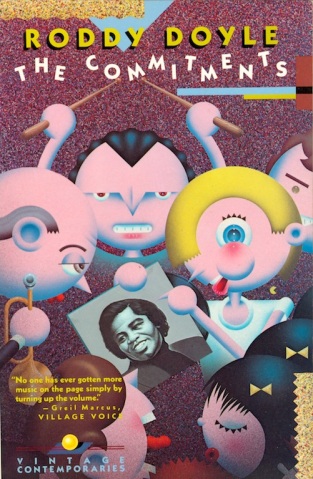
Still, I was proud of the books I brought to this prestigious and beautifully packaged series: novels by Mona Simpson and Kaye Gibbons; a Vintage original in the form of Roddy Doyle’s The Commitments, later a fine movie; short stories from the South, The All-Girl Football Team by Lewis Nordan.
 Working with Lorraine Louie was one of the highlights of a difficult assignment: I found many colleagues eager to cash in on the high profile Gary Fisketjon had established for the series. Lorraine didn’t play office politics. She was warm, professional, and resourceful.
The covers for Kaye Gibbons’ novel Ellen Foster show the progression of Lorraine’s design. I bought the reprint rights to this tale told by a whip-smart eleven-year-old orphan from Algonquin of Chapel Hill, whose cover featured a photo of an unmade bed with an old-fashioned metal headboard.
The first Vintage edition, issued in 1988, showcased the author’s name at the top in a bold purple box the color of the Easter vestments priests wore at the Catholic Church I attended as a kid. The cover illustration by Chris Moore featured an equally bold blue background with a four poster bed surrealistically floating in water of a similar hue. The blue sky above the bed glistened with gold stars; an arresting image of the way the world might look to a disoriented child. It was so bold in its colors and images that it might have been the cover of a children’s book, or a movie poster.
Two years later, in the spring of 1990, a new edition of Ellen Foster appeared, in a new design for the Vintage Contemporaries series overall. Gone were the boldly colored boxes on a grid with author, title, and illustration in a row from top to bottom. The boxes were now colored in subtle shades of sage, beige, and white: the illustration for Kaye’s beloved novel was now the same period-looking platinum print by David Hyman that had adorned the original Algonquin cover.
Though the author’s name was still on top, the illustration went beneath it. At the bottom was the title, just above Walker Percy’s quote calling Kaye’s heroine a Southern Holden Caulfield. Of course the VC logo, a gold ball floating on a blue oblong dissected by two red lines, remained the same, though all of the typefaces had gone from a blocky, all-caps sans serif to a much more delicate one that swirled and curled. Ellen Foster was spelled out in mauve.
The new cover was meant to appeal to a more sophisticated readership, one that would gravitate to a subtler approach. In truth, I liked them both.
I salute Lorraine Louie and regret her passing. She was a total pro.
—Patricia Mulcahy, editor
I thought my first novel was a story of a woman trying to learn to love her life. When my great editor at Vintage, Pat Mulcahy, called to talk to me about it, she said I was sort of missing the point. “Her daughter disappeared. Anne’s daughter, Sarah, is the heart of the novel. You’ve written a psychological mystery.” I told her I expected most readers would figure out Sarah’s fate in the first fifty pages.
Pat was genuinely smart and funny, but she didn’t consider our editorial conversations debates. She said I was wrong.
A few weeks later, she sent the manuscript to Susan Kenney, whose novels included the superb In Another Country. Susan wanted to endorse the book, but she called Pat after about 100 pages and said she couldn’t keep reading unless Pat told her what had happened to Sarah. The mystery of Sarah’s fate was too much tension for her. Pat repeated all of this to me, just in case I was wondering which of us has been right from the start.
And then the first pass of the cover arrived, with Lorraine’s design and Rick Lovell’s unsettlingly ghoulish pastel graphic-Gothic portrait of a half-seen blonde girl. Pat sent me a copy of the proposed cover with a note that read, “What do you think?”
I don’t love admitting that I was wrong. Let’s just say, after dozens of reviews by dozens of opinionated people who’d read my novel, the design was unchanged. Everybody thought the Vintage Contemporaries art team had, as usual, got it just right.
And they had.
—Michael Downing, author
The Last Election was my first novel, written when I was 25, and I was a bit of a kid really. Just to be published at home in England was a blast; to get picked up in New York and published in the States as well was more than I could have imagined ever happening. I suppose the opportunity to go and get myself thrown out of American night clubs instead of London ones seemed a tremendous leap forward at the time.
I did love the cover, though. It took the book as a thriller, which was how at heart I meant it to be. It was the best jacket anyone came up with for that book, I’m sure.
More important, I loved the look of the imprint as a whole. It had a real Family-Of-Distinction sort of cachet about it, and for a no-name tyro like me to be part of it was a proper privilege, like someone telling me I was an actual grown-up writer. I wasn’t, but I wanted to be, and it did make me feel that way.
I was certainly in some excellent company—Richard Russo, Raymond Carver, Don DeLillo, Richard Ford—way better writers than me. It gave me a lot of confidence. Vintage Contemporaries felt like a bunch of people who had something to say about the shape and drift of the modern world that might really be worth listening to, and the sharp, laid-back elegance of the collective house style—sassy without ever getting dated—really helped create that feeling. An accurate feeling, too—it was just very good publishing.
I tip my hat to Gary Fisketjon and all who were involved, and thank them very much indeed for including me.
—Pete Davies, author
Family Resemblances had two different covers, for the hardback and paperback. I don’t remember being asked for much feedback on either one during the design stage. I was what my editor, Anne Freedgood, called “a peaceable author”; I pretty much figured it was my job to write the book and theirs to publish it, which included giving it a cover.
To me, the hardback cover feels a little simplistic. Iconic elements of the story are present—a front porch, a Buick, a gazebo, a suitcase on the porch suggesting arrival and departure, the night sky—but they are gathered together in a contrived way that says a little too plainly, “See, here’s what you’ll find inside.” It’s as if the cover artist assembled a collection of signs rather than imagining his or her way into the world of the story. The assignment was carried out, I would say, dutifully rather than from the heart.
The cover of the paperback feels like it was done by someone who not only read the book but experienced it, became temporarily part of it—a reader-artist who felt a kind of ownership of the book. If the hardback cover was a summary, the paperback cover (with one barely noticeable exception: the falling gazebo in the upper left, which comes off as too schematic) was the story itself.
In this cover it’s as if the viewer is already living inside the book, walking down the block on which the main action of the story takes place. The Buick (which here is more accurately the age of the one in the story) becomes a framing device pictorially, which is exactly what it is in the novel as well. The house, which is the heart of the story, is seen reflected in its window, and the details of the house make it clear that the artist paid close attention to the physical world of the book. I’ve always taken to heart Conrad’s maxim that the writer’s first duty is to make the reader see, but of course it’s impossible to make a reader do anything; creative reading is required as well as creative writing. To create an excellent book cover, one must have made an imaginative commitment as a reader first.
The practice of creating images for book covers speaks to something very basic in people: we appear to be wired to have loyalty to a visual image. Every nation has its flag, every university its seal, every product its logo. Religions each have their visual symbol. Our expectations of the thing itself, even our understanding of its essence, somehow attach to an image, and this is true of a book cover, for better or worse. When it’s done well, it becomes a glimpse of what John Gardner said fiction is: “the entertainment of the soul.”
—Lowry Pei, author
The hardcover of The Garden State was originally published by Harcourt Brace Jovanovich (now part of Houghton Mifflin Harcourt). HBJ, of course, was a venerable and esteemed literary house, but it wasn’t really perceived as being at the red-hot center of publishing in the late 1980s. So when editor Robin Desser of Vintage made a preempt offer for the paperback rights, I was very pleasantly surprised.
Vintage Contemporaries had the reputation of being culturally of-the-moment, so I thought that being a Vintage author might give me street cred. I’m not sure that it really did—or that it made getting a reservation at the Union Square Café any easier—but I do feel that the Vintage imprimatur may have lifted my profile a little.
I never published another book with Vintage, so any sense of myself as a “Vintage Contemporaries author” was short-lived. I did meet a few other VC authors when Vintage brought several of us to Washington, D.C. to meet booksellers at Book Expo America (or whatever it was called then). I didn’t really get to know the other authors, though, and didn’t feel any particular artistic kinship with any of them, except maybe Richard Russo. I shared a cab with him and his wife and remember thinking that he was just a regular guy like me, writing as honestly and unpretentiously as he could about modern life.
But then there was another author—a well-known name whose reputation seemed to be based on a remarkably small opus—who made a stink at the front desk of our hotel when he didn’t like the room he’d been assigned. I remember marveling at the healthy sense of entitlement and self-worth. I’ve never been very good at the whole prima donna-writer-thing. At the time, I was just amazed and grateful that a publisher was actually paying my hotel bill.
I had no input into the design, so I was a little surprised when I first saw it. This was (I think) one of the first Vintage Contemporaries I had seen with a front illustration that bled to all four edges of the book. But it was still recognizable as a VC book, so I was satisfied.
My feelings about the illustration itself were mostly positive. I loved the color palette, and I thought the designer had really captured the rueful, searching, slightly absurdist tone of the stories. I did worry at the time that the obviously immature figure on the cover might make it look too much like a young man’s first book. But the fact is, it was a young man’s first book, so I’ve since changed my mind about that aspect of the design.
I think Vintage’s early designs did a great job of visually suggesting that all of the books shared a certain kind of contemporary sensibility—very true to the times—while also doing justice to the uniqueness of each book. I don’t think you see much of that kind of consistent look in book design today, except maybe in reissues of a particular author’s backlist.
—Gary Krist, author
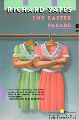
[Richard Yates’s literary agent Ned] Leavitt arranged for Random House to reissue Revolutionary Road, Eleven Kinds of Loneliness, and The Easter Parade as part of their popular Vintage Contemporaries line, a deal that promised to revitalize Yates’s career somewhat. This happy prospect was diminished, however, when Yates saw the cover art, which so enraged him that he was tempted to stop the presses with legal action.
“Why has surrealism been chosen as the cover style for these novels, when I can find it on no other Vintage books?” he wrote in a memo to Leavitt.
The proposed cover for Revolutionary Road depicted a small suburban house and church within a floating glass jar, against which was propped a ladder; Yates thought this inexplicably evoked Sylvia Plath’s Bell Jar, that the ladder was a “mixed metaphor,” and that the church was “wholly inappropriate.” He demanded that the “three offending images” be removed and the house lowered to the ground.
As for the cover of The Easter Parade (two hanging dresses with folded human arms): “The picture is gruesome, to no purpose. Does it mean to suggest identical twins who have only coat-hanger hooks where their heads ought to be? I am entirely baffled and believe readers will be, too.”
With little change, though, the covers were allowed to stand.
—from A Tragic Honesty: The Life and Work of Richard Yates by Blake Bailey
My first book, House of Heroes, was accepted for publication very suddenly (before the manuscript was completed, I was barely out of graduate school)—thanks, I believe, to a confluence of favorable circumstances. A set of three of the stories won a national award, the award came with ready made blurbs from two literary star judges, the preliminary judge ended up being my editor, and in that brief moment her publishing house had some success publishing short stories. The Vintage Contemporaries paperback contract seemed to come along just as easily.
Vintage Contemporaries was a knockout series in the eighties and early nineties. Membership indicated one was vintage and new all at once. There were some wonderful members of this group, Raymond Carver and Richard Ford, Joy Williams and Richard Yates. The series had a look, it stood out, the authors’ names were spelled out in white in a band of bold color on the spine. You could collect them and put them all next to each other on your young person’s contemporary literature shelf.
Except for writing the book, which informed the illustrator, I had nothing to do with the cover. I liked the look of the series but the illustration on my cover was, ostensibly, the depiction of a scene in my story, “Anna In a Small Town.”
This “Anna” looked nothing like the Anna of my mind’s eye. The story is about a giant woman, a real one, who lived in the north woods of Wisconsin, worked at the town’s post office, played first base on her local tavern’s softball team. The giant is the narrator’s cousin, similar to one of my real cousins who is now deceased. I imagined she had bouffant hair and blue eye shadow, wore jeans and sneakers and her shiny Baldy and Mary’s Tavern nylon softball jacket.
I needed to accept that though Anna doesn’t look circa 1970’s Midwest casual, everything, psychologically, about the cover, illustrated by Vivienne Flesher, is true. Anna’s enormous presence amidst the ignoring crowd, her earnest adornment—a purse, looking miniaturized by her giant wrist—was something I had described. She has a distinct hairstyle, but the men and the other woman in the crowd resemble clothed mannequins with painted heads, differentiated only by color. The period of people’s clothing and especially Anna’s dress looks 1940s or 50s, possibly a mixture of periods—vintage, in other words.
The colors, the style, now that years have passed, transcend what might otherwise have become dated. It looks modern, painterly, but also timeless, and I’m glad of that.
—Mary LaChapelle, author
In my contract for The Colorist, as I had with my first book, L.C. (published by Harcourt, Brace), there was a bit that stated I would be involved in decisions about cover design. With L.C., I was involved, but with The Colorist this was not the case, despite the wording in the contract.
The Colorist was the story of two women, a colorist and an inker who rewrite their own version of Electra (not to be confused with the real comic, Elektra) when that comic is terminated. It was also about their adventures in the pre-Web world of art in the age of mechanical reproduction.
At first, I was a little dismayed with the cover because Electra wasn’t as I had imagined her, but in fact, the older comic book style was exactly right. The image of the colorist wearing a mask with paint smudged on it was graphically very different, more like illustration, reminiscent of Garth Williams’s pen and ink drawing, and I liked the stylistic contrasts which seemed to obliquely hint at what was going on in the novel.
I intended to write to Lorraine about the cover design, and now wish that I had. One of those things you take for granted because you think there will always be time, and then it turns out there isn’t.
—Susan Daitch, author
Some writers accept covers, some reject covers, and some have covers thrust upon them. My experience with the covers of my novels has been largely in the latter category. At some point between the second pass of the manuscript and the arrival of the galley, I am presented with a cover. Occasionally I like the design, but when I don’t, I’m routinely informed, “We like the image, and it’s too late to change it.” So, I’m gloomy about some of my covers, especially the early books which came out in the 70’s, when cover design was pretty routinely boring.
In 1988, after an eight-year hiatus during which my editor moved house and didn’t take me with him, I was fortunate enough to sign a three-book contract with Nan Talese, who had recently arrived at Houghton and Mifflin. My third novel, A Recent Martyr, and a collection of stories, The Consolation of Nature, were the first two books I did with Nan. The H&M dust jackets, which had a consistent design—an illustration contained in a box on a solid background with the title and my name in thin lettering firmly outside the box—were fine with me. I didn’t complain.
I was hopeful when I learned that the paperbacks for these two books would come from Vintage, as I had admired the look of their books for many years. Also, at that time Vintage just felt like the place everybody wanted to be. I think it still is, actually. The Vintage Contemporaries series was relatively new when my books were published, and I suspect there are now some Vintage Contemporaries titles out there by writers who could no longer be described as contemporaneous.
I didn’t see the Vintage covers until late in the game, but I liked them both a lot, so mostly what I felt was relief. Each one clearly stated the designer’s indebtedness to two artists whose paintings I’ve long admired: Edward Hopper and Henri Rousseau.
The cover for A Recent Martyr has a lot of pink and dark green in it, a fashionable combo at the time. The image, a woman seated at a diner table, a cup of coffee in front of her, gazing moodily through a very large plate glass window at the street outside, has the sad, Hopperish quality of alienation that Americans instantly recognize as “us.”
The woman appears to be gazing at the very nice quote from Margaret Atwood in dark green print towards the bottom of the window. But the composition, including the clock that reads quarter-to-five (A.M? P.M.? The light doesn’t let on.) leads the viewer’s eye to the un-Hopperish detail that says it all—a wrought iron balcony wrapped around what appears to be a stucco building with shutters. It’s quarter-to-five, and you are in New Orleans with a woman in a low-cut summer dress drinking strong coffee and trying to figure out what to do next.
The cover for The Consolation of Nature (which was originally titled Dead Animal Stories, but I probably don’t even need to go into that), pays homage to Henri Rousseau’s painting “The Dream.” Another woman, this time on a couch and in profile, lounges in a tropical jungle in which various animals—a dog, a cat, some bugs—are moving about ominously. The fact that they are domestic animals and not the scary snakes and lions of the painting being quoted is—like the ironwork in the Recent Martyr cover—both ironic and informative.
The animals in this collection of stories are all urban creatures, some of them quite threatening—for example, rats—and all of them, sad to say, doomed. The human characters muddle on with their lives, often nostalgic for the Garden of Eden, which is really right there, all around them, if only they could wake from the dream that is self-consciousness and see it.
I never met Lorraine Louie. I am saddened to learn that she is no longer among us and I appreciate this opportunity to say now, in a public way: Well done.
—Valerie Martin, author

























Wow. This really brings back some very fond memories; great stories to illustrate, and great designers, art directors and editors to work with. Thanks to Sean for pulling it all together to celebrate this wonderful imprint.
Ricks Lovell’s comments about current ADs were very accurate. Some are great (young and old) but far too many assume you (the illustrator) are as visually clueless as they are. And there are other ADs who are simply AWOL throughout the entire cover/interior process unless the book involves a marquee name.
Pingback: Afternoon Bites: “About Cherry” In NYC, Vintage Contemporaries, Mat Johnson Interviews Victor LaValle, and More | Vol. 1 Brooklyn
This is the most comprehensive article to date about Vintage Contemporaries, and an important and interesting time in publishing.
Thanks Sean for your clear focus.
Amazing. Thank you so much for this—I’ve been a fan of these for years and always am on the lookout for the rarer of these editions. I’ve been wanting to know this story for ages. Thanks again!
Pingback: Friday Reads: Religion and Royals and Other Stuff « Emphatic Hands
“So Happy Together” when design & illustration met so well
A wonderful display – and to read responses from the authors
A Renaissance period in design – Lorraine Louie – a quiet giant
Thank you
Pingback: A Short Riff on Those Horrid, Wonderful Vintage Contemporaries Paperbacks of the 1980s | biblioklept