(Faber & Faber, 2011)
I tried to imagine a cover for Love Goes To Buildings On Fire as I was writing it, but it was tough to fix on a single image that would represent the full scope of the thing, and I hated the idea of a photo collage. The best I came up with was a photo by Martha Cooper—who shot for the New York Post beginning in the late ’70s—of a kid playing trumpet alongside some ruined Manhattan piers. But she’d already used it for the cover of her own book, New York State Of Mind.
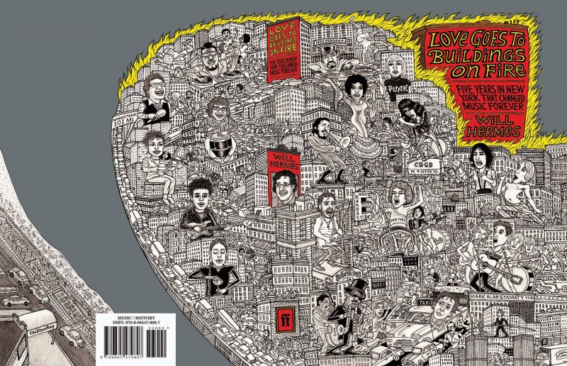
Eventually, me; my editor, Paul Elie; and Susan Mitchell, who was Farrar, Straus & Giroux’s art director, sat down one afternoon and brainstormed. I brought some Village Voice back issues and a Punk magazine anthology. Susan hit on the idea to use Mark, which seemed perfect, because of his connection to the Voice during that period, and because he can weave and compress lots of information into a drawing, which is kinda analogous what I’d done in the narrative.
I sent Mark a (ridiculously) long list of visually notable people and events as a jump-off point. When I saw his first draft, I was amazed. Along with all the specific figures and their relative map-point locations, he totally caught that crazy, dirty, thrilling, black + white NYC energy that I remembered—a memory that, of course, was informed by Mark’s work in the Voice over the years. I totally loved it.
He tweaked some small things in the final version, like clothing and hairstyles, to zero in on the era. He put Debbie Harry in a Punk t-shirt, for example, to reference a famous photo.
But he pretty much nailed it on the first pass—even the grace notes, like the Woodstock mileage sign on the West Side Highway, and Springsteen’s beloved Stone Pony on the Asbury Park beachfront across the Hudson. He’s brilliant, and I couldn’t be more grateful. He even put my unshaven mug on the spine.
—Will Hermes, author
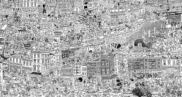
I was asked to design a cover for Will Hermes’s book Love Goes To Buildings On Fire because of past works I’d done depicting crowded city streets. One of those works was my children’s book Who Needs Donuts? which was first published in 1973 and republished in 2003. Two other examples were drawings of Greenwich Village and Times Square, which appeared in the Village Voice in 1977 and 1978 and which were sold also as posters. I lived on MacDougal Street throughout the 1970s, so I have distinct memories of New York City in that era.
What they asked me to do for this cover was to work in the sort of “map” style of those posters and place some of the musicians discussed in the Will Hermes’s book. So, first off, I had to decide which musicians to include based on what was given to me to choose from. I read a long excerpt of the manuscript to get the feel of the book and I sought out visual references at the library and on the internet.
I decided early on—in part through discussions with the art director and editor—that I would make the drawing black and white and use color only in the background and the title. Then came the process of building the composition of the buildings, the musicians, and some various details such as the tightrope walker Philippe Pettit and a tabloid headline about “Son of Sam” to give some more feel of the 1970s.
Building a composition of this sort is a somewhat complex process to get all the informational stuff in there and also have the right feeling to the image in terms of its abstract composition. So first of all, I work in a scribbly manner to get that gestalt sense I’m seeking. The overall shape of the “map” was, from the start, intended to be a wraparound, front to back. I needed to make a shape that kind of looked like a map but, in fact, wasn’t. It was a suggestion of a map.
When I showed the first sketch, the editor wondered if I might also be able to include the Stone Pony bar in Asbury Park and some indication of Woodstock. I solved the Woodstock issue with a sign on the West Side Highway and the Stone Pony part by adding it in the lower left of the back cover in a little indication of its seaside locale, which, as it happened, I knew well, having grown up two miles from Asbury Park.
I’ve done a lot of crowd-scene pictures in my career in this style and in somewhat differentiated approaches, so this assignment was “right up my alley” and a pleasure. And eventually I met Will Hermes, who is a very nice guy.
—Mark Alan Stamaty, artist


Waoow… incredible design ! I love your Faber & Faber, 2011 Design ! Its quiet cool and classic look. 🙂
This is great!