(Farrar, Straus and Giroux, 1991)
I care a lot about what books look like, so when my first book was being published I was worried. I had been unable to find a single image that could be put on the cover to show at a glance something of the book’s heart. But then I didn’t yet know the work of Barbara deWilde, whose designs extend and complement the texts they envelop.
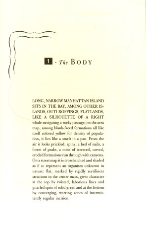
What she did for Low Life is better than anything I could have imagined. Not only is her design beautiful, it also demonstrates and conveys a subtle understanding of what I was trying to do in the book. This understanding extends right down to the setting of the pages, in which a decorous typeface evocative of hot lead is ornamented in the chapter openings and running heads by ornate typographical frills on one side and by aggressively modern white-on-black blocks on the other. The clash beween old and new, cursive and rectilinear, dramatic excess and blunt functionality is a metonymic representation of one of the book’s underlying themes.
And then there’s the cover: a Bowery swell is cut up and his soul is revealed. He rises from a childhood that was knockabout but pure to dream himself as a youth in the flophouse; his heart is in the fleshpots of the boulevard, and his head is filled with violence and noise. A tough guy, sure, but all alone, and protected by nothing but some cheap gimcrack jewelry—his horseshoe stickpin is even upside-down. We can’t see his eyes, but then who can remember who he was? That’s what I meant by “low life”: the vast riffraff lost to history who made New York City and ultimately begot us before being run over by the thing they made. Barbara managed to get this tall pile of meaning into a single, powerful, dynamic image, a traffic light of a composition that stops the eye from yards away, black and white and red all over like a Constructivist checkerboard. I’m incredibly fortunate to have had a real work of art function as the come-on for my book.
—Luc Sante, author
I think it’s important when talking about the design of this jacket to mention where it sits on the technology timeline. It was designed before computers were the dominant design and production tool for publishing. The layers that you see of bridge jumper mixed with street urchins and confiscated weapons were sliced together with photostatic prints and assembled at the printer’s shop. A similar design would be easy to compose today, and probably easier to conceive.
I was given the assignment by a lovely woman named Doris. FSG did not have an art director; Doris was a print production manager. She liked “those things that you young people are doing…” (meaning design). I was not her main focus; Chip Kidd and I went to see her together. The next day we received the manuscript in a large package. We weren’t told who the author was or what the title or subject would be, just that she had a book for us to work on. I took one look at the subtitle and put it under my chair. A history of old New York, ugh. Another book about the Astors! I felt that Knopf had already published this book many times before. I was so disappointed.
About a week before the sketch was due, I pulled the manuscript out and started reading. It was remarkable…how I had glanced at the manuscript and misread it, I’ll never know. Yes, the book was a history of New York, but from the point of view of the lower class, the low life. This was the history that I had never read, and the history that described the New York that I knew: the Lower East Side, Bowery, the areas under bridges.
I was completely riveted. I kept talking about the book with Chip, who said, “Why don’t you just do this one? You love it so much.” I wanted the jacket to feel human, for the design to immediately relay the point of view. That’s why I interspersed the torso photograph of the bridge jumper with the other New York images, so the whole would be a body formed with these parts. If I had had my way, we would have screen printed the title in florescent ink over the photograph to make it jump off the page.
—Barbara deWilde, designer


