(Little, Brown and Company, 2001)
Every cover design has its challenges, but I remember this cover as being particularly daunting. After reading Rick’s short story “Demonology” for the first time, I was so affected by it that I actually read it to my to my girlfriend (now wife) over the telephone that evening. I (Rick) made her cry. Also adding to the difficulty was that, in this case, the cover had to work for a collection of different short stories. So I was really focused on trying to come up with something that would work for both.
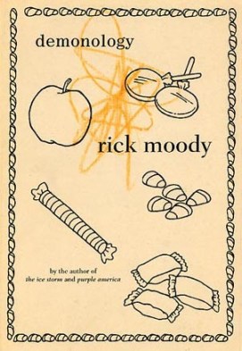
This cover was designed back in 2000, so the details are a bit hazy. I know there were others, but the only other direction I could find was a pastiche of a typical page from a child’s coloring book.
In retrospect, I am so very, very thankful that we didn’t end up going in that direction. Of the covers I’ve designed, the Smarties cover is still one of my favorites.
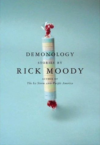
The idea to use Smarties came from the very first sentence/paragraph of the book: “…Gimme your Smarties, please?…” Levitating them is what makes the cover for me. (Creepy/ghost-like/demonic?) That and the fact that the cover is so symetrical, but yet there is this ever-so-slight imperfection in the angle of the candy. It’s not quite perpendicular to the typography. Mark Twain once wrote, “The difference between the almost-right word and the right word is really a large matter—it’s the difference between the lightning bug and the lightning.” I feel the same way about where/how an object is placed on the page (or cover).
The Smarties also happen to be a “collection” of candies, so it reflected the idea of a collection of stories. The teal background was a lift of the color of one of the Smarties. I recall trying it in a number of the other Smartie pastel colors but the teal won out in the end.
Shortly after the hardcover was published in 2001, Little, Brown asked me to develop a series look—based on the cover of Demonology— for Rick’s back list.
—Paul Sahre, designer
The Back Bay paperback jacket of Demonology is roughly the same as the hardcover jacket, which was very popular and influential at the time. It was probably my first great jacket. Before then I had always had slightly fuzzy and imperfect jackets. I mean fuzzy from a design point of view (although my very first book, Garden State, had my own photographs on the cover, and I probably shouldn’t complain about that).
Demonology is great because it’s graphically really simple—it’s just a pack of Smarties, the candy, against a teal backdrop—and because it swiped the Garamond typeface that Dave Eggers was using for McSweeney’s at the time (which caused it to look elegant from a type perspective, as well). The teal color is almost a Tiffany box color, which makes it look valuable, and while the Smarties are in fact contained in one of the stories in the book, I always took their appearance on the jacket to mean: that this writer is smart. Which pleased me. All in all, from many perspectives, a total success. So much so that when I needed a Web site in 2010, we (the Little, Brown design team and myself) summoned up the same designer, Paul Sahre.
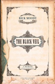
I’m not Stephen King. I have no approval over my jackets. I have “jacket consultation.” I believe that’s the language in the contract. It means they will show you the jacket before they put it on the book, and if you’re lucky they will listen to you if you think it’s awful. They have shown me jackets over the years, and I have expressed esteem when I felt esteem, which has not been infrequent, and I have held my tongue when they were borderline, so as to save up capital for when they were not (you must choose your battles carefully in this area), and on occasion, when things were a real mess, I have stamped my feet a bit. I got The Black Veil jacket changed at a certain point when I thought it was bad, and I think they ended up with a really great jacket on that one too. Then there was, later on, The Diviners jacket, which is a long story of heartache, and I’m not going to get into that today.
The uniform paperbacks came about because of the popularity of the Demonology jacket. It had an impact. And so Little, Brown felt that it would be useful to subject the other books to the same kind of simplicity and graphic directness. I think that was a smart idea. In most cases they are improvements on the hardcover jackets. It wasn’t my idea, but I think it’s a good idea. I am kind of lucky, in fact. I don’t know too many writers of my vintage who have stayed with one publisher so long (almost twenty years now), and the paperbacks came about in part because of that.
The jacket for The Four Fingers of Death was extremely popular as well. I think it won an award of some kind in the world of jacket designers, in fact. I actually made some suggestions on that one, before it was designed, and I think I had a bit of an impact. And therefore: it was so popular that they wanted to hang onto it for the paperback, or that is my understanding. Maybe Little, Brown would have another point of view on this, I don’t know.
I see my role as being the guy who makes the interior of the books. Therefore, it is important for me to try to stay out the jacket discussion, unless I really love what is on there, or if I am so unhappy that I think I will not be able to let go of my feelings. Those are the two situations where I think it’s important to let my opinion be known.
—Rick Moody, author


