(Vintage, 2008)
Most writers I know don’t dream of a cover they adore when considering their next book; they just hope to avoid something they don’t like, or worse, they hate.
I didn’t at all hate the first cover design that Vintage, and its designer, John Gall, ran by me for Like You’d Understand, Anyway, but I instantly knew it was misleading about the book. It was a nicely surreal image of a young man floating halfway to the ceiling in the aisle of a grocery store. While I liked the strangeness of it, I also thought it suggested a collection full of stories about dull suburbia quietly transformed and passed that reaction on to Vintage.
What they sent back as their second attempt is the present cover, which I thought suggested with an appealing self-consciousness a mix of the exotic and the adventurous, presented with a confrontational directness (a slightly stunned-looking astronaut in bright orange against an electric blue background) that seemed both oddly unsettling and goofy.
In other words, in all sorts of ways, when it came to the fiction the cover would represent, I thought they got it right.
—Jim Shepard, author
Jim Shepard is one of my favorite writers. He clinched things for me by once writing a story from the perspective of the Who’s great, silent bass player, John Entwistle. Like You’d Understand, Anyway is one of his very best collections of stories—though I say that each time he comes out with a new book. Let’s say I was excited to work on this.
There are a few things to keep in mind on a project like this. One of the challenges about being an art director/designer at Vintage Books is that a good chunk of the job consists of redesigning covers originally created by the renowned Knopf art department. This particular book was came my way with an already award-winning jacket designed by Jason Booher.
Since this book was nominated for the National Book Award, design consideration had to be made for a shiny silver or gold sticker. Award-winning books are the best thing that can happen to a book—for the writer, the publisher, the company—for everyone except the art department. That sweet medallion has messed up many wonderful designs.
The final consideration was the content itself. This is a collection of stories. I generally approach story collections in one of the following ways:
1. Work with the title story as source for cover concept.
2. Work with the title of the collection for concept.
3. Find an overall theme in the author’s work and use that as a starting point.
Or any combination of the above.
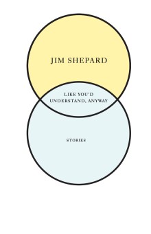
It’s been a while since I read this book, so I don’t remember the reasons behind many of these (very unfinished) sketches. Venn diagram? Makes sense, I guess. Bloody nose? Block of wood? Who knows. The doll wrapped in bandages? I try this on every other cover I work on.
In the end, this was really a great title to work with because all you really need to do is show someone doing something mystifying. This is how I settled on the astronaut. One of the stories is about a lovelorn Russian cosmonaut, and what is more mystifying than seeing someone walk around earth in a space suit?
Although I really liked the Dennis Darzacq image of the guy floating in the supermarket (I later used one of his photos on a Tom McCarthy book cover), itdidn’t quite make sense. I also occasionally like to combine a couple of ideas I’ve been working on to see if anything happens (nothing here, move along).
Once I found the image of the astronaut on the blue background, I knew it was perfect, the pose, the expression were all just right. Just needed an orange coat of Photoshop paint on the spacesuit. Tried a few type solutions, then I decided to go whole hog with a nice, big, nearly commercial type solution.
Read Jim Shepard!
—John Gall, designer


garamound italic titling caps? great cover. obviously suggestive/ complementary to the title with the “this shit ain’t rocket science” which work before and/or after the read
love your blog. 🙂