
(Knopf, 2012)
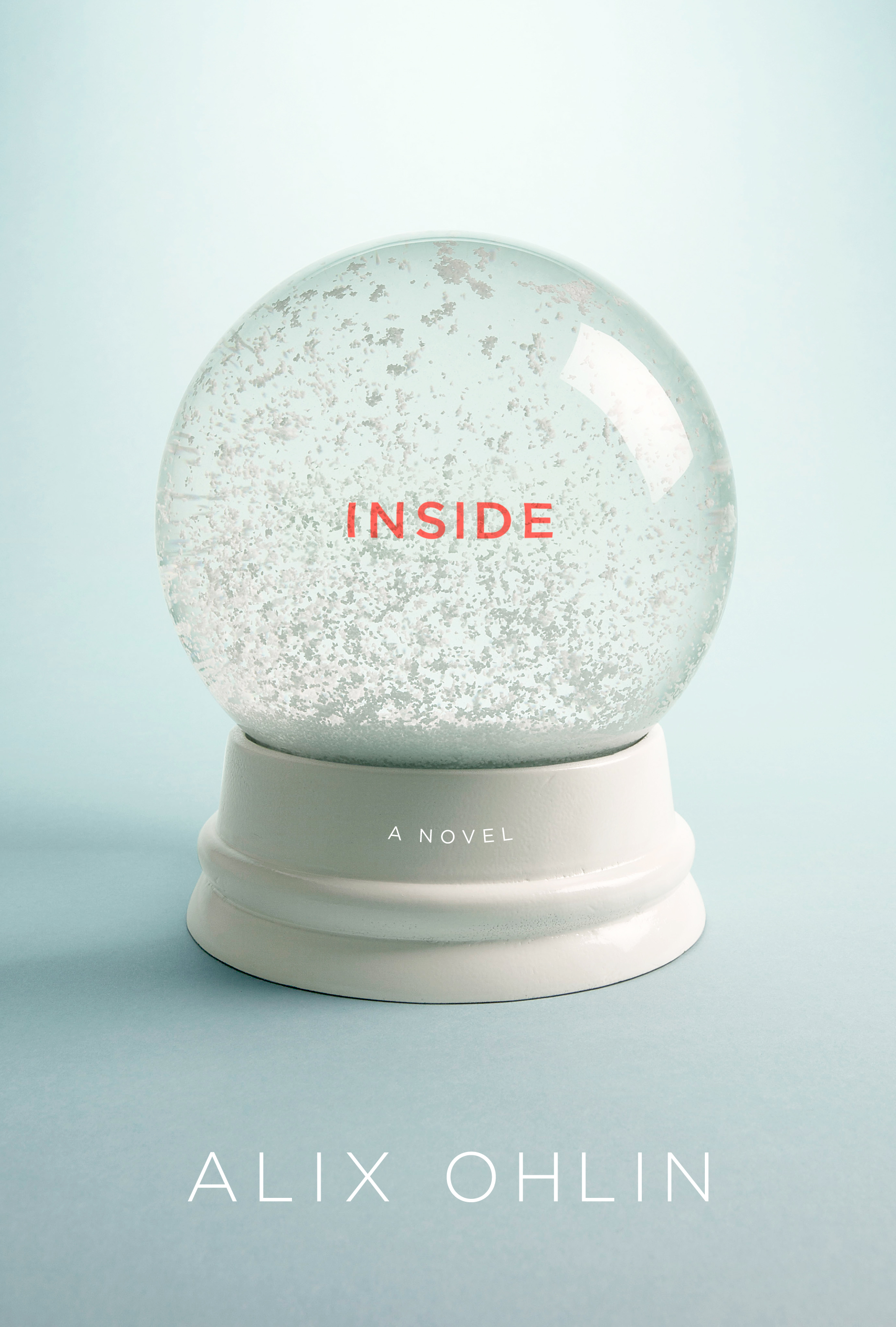
I couldn’t have been happier the first time I saw the cover image. It seemed like a perfect visual metaphor for my book, which is very psychological, very much concerned with the “interior weather” of the characters. You can see the landscape inside a snow globe, but you can’t get there, so the image connotes both intimacy and separation.
I think I only asked for one change, and it was for completely practical reasons. The first version was a very pale blue, maybe even white.
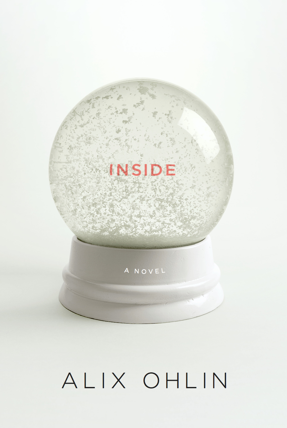
I used to work at a bookstore and I always felt like white jackets showed dirt and smudges more, so I asked for a slightly darker shade of blue. The final palette suits the tone of the novel—it’s wistful, but with splashes of color that signal brightness and hope. For the Canadian edition, they put a glossy treatment on the globe, which is also lovely.
—Alix Ohlin, author
I was lucky enough to design the covers for Alix Ohlin’s books The Missing Person and Babylon and Other Stories when I was in-house at Knopf. I loved both and so I was thrilled to work on Inside for art director Carol Devine Carson.

From the first page, I had images of wintry cold whites in my mind. The main character, Grace, is out cross-country skiing and discovers a man who has unsuccessfully tried to commit suicide in the woods. As I read deeper, an underlying theme emerged: the danger and thrill of letting ourselves be available and vulnerable. Grace is determined to help the man to the point of exhaustion. (I can’t reveal what happens between those two, though. You have to read it!)
A snow globe seemed like the perfect metaphor to depict the idea that we all want to get “inside” and connect to each other. That we never really know what anyone is truly thinking despite how intimate we may be.
So I started looking for images of snow globes online. But the ones I found had random floaty things inside and dated-looking wooden bases. Ohlin’s writing is soulful and witty, and I thought that the cover should look fresh.
I decided to produce it on my own and was lucky to find a snow globe kit online which I sent to the wonderful photographer Simon Lee. We painted the base white and he shot it on a frosty white background. First I was tempted to make the type look like it was being shaken inside the globe with the snow, but on the other hand, it needed to be easily readable and direct. Especially great one-word titles should be in plain view for the reader.
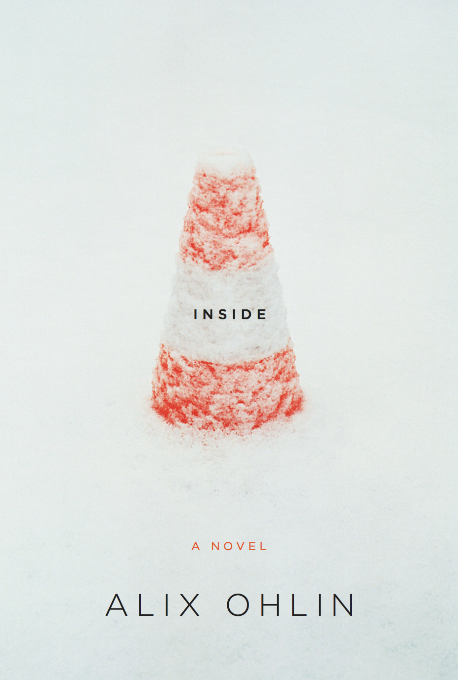
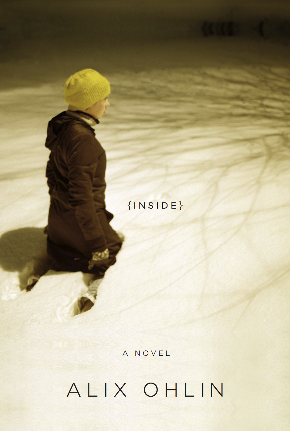
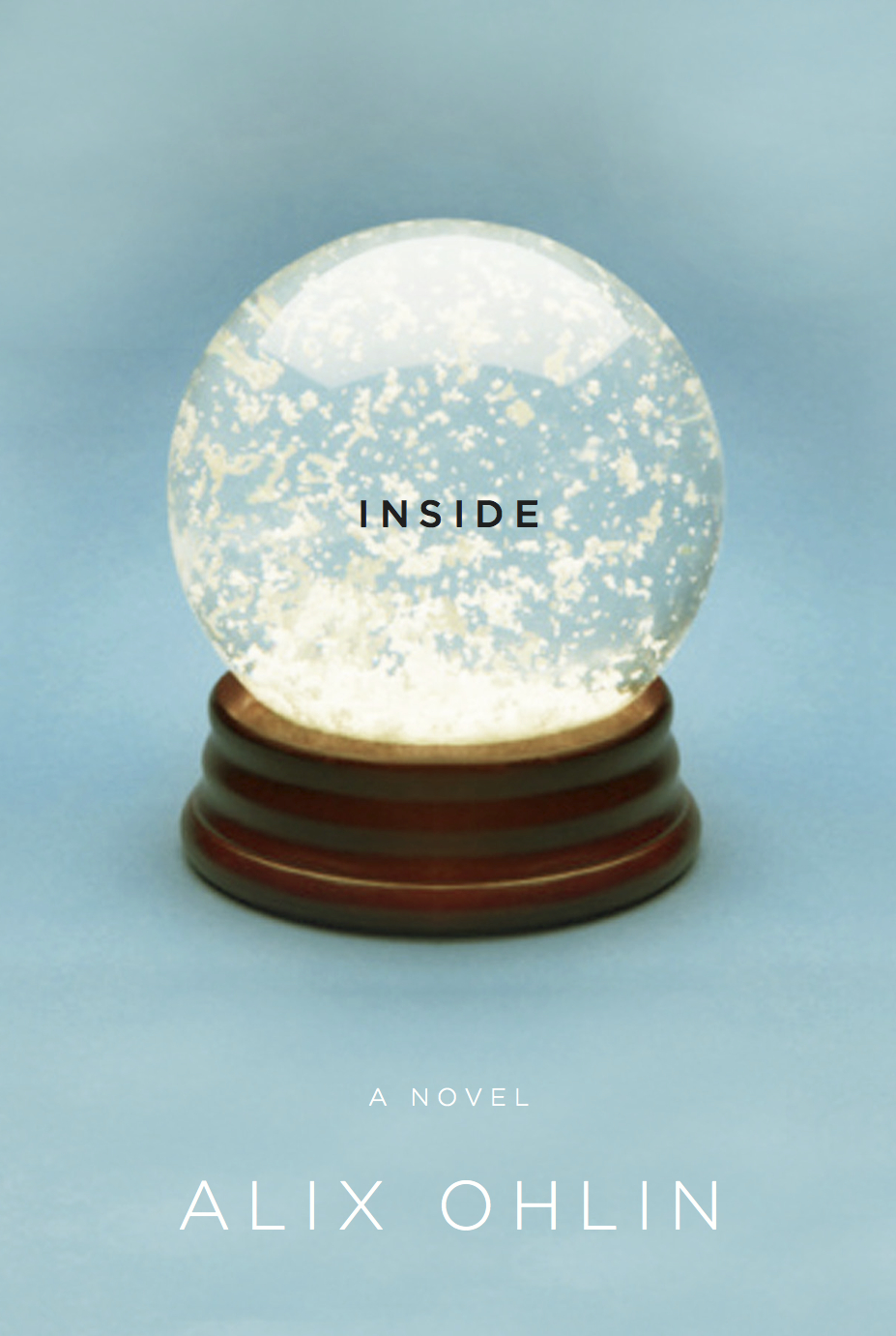
Initially, I submitted several backup directions, like the safety cone and the woman in the snow, but my gut was with the snow globe because it seemed more iconic. And who doesn’t love a snow globe?
—Gabriele Wilson, designer

Amazing images, so simple and perfect as it should be