

(Little, Brown and Company, 2012)
When I first started talking book covers with my editor, Judy Clain, I only had a few stipulations: No script, no embossed title, and no pale pink. I think I was having nightmarish visions of the books I’d seen in my youth on the racks at the drugstore—all ripping bodices and women clinging to a swashbuckler’s muscular leg. Yes: the idea of book covers can cause some pretty extreme and unreasonable paranoia.
Of course, my parameters were less than helpful and Judy, kindly nudging me, suggested I might think about existing covers that appealed to me. In the end, because Tigers in Red Weather is set between 1944 and 1969, I sent her a series of very stylized, retro covers done for Margaret Atwood by Anchor—The Blind Assassin, The Robber Bride, and Moral Disorder and Other Stories—that I had long coveted.

A few days later, Judy e-mailed to say that she had passed my suggestions to their creative director, Mario J. Pulice, and—lo and behold—it turned out he was the one who had designed the Atwood covers. This was going very well, I thought.
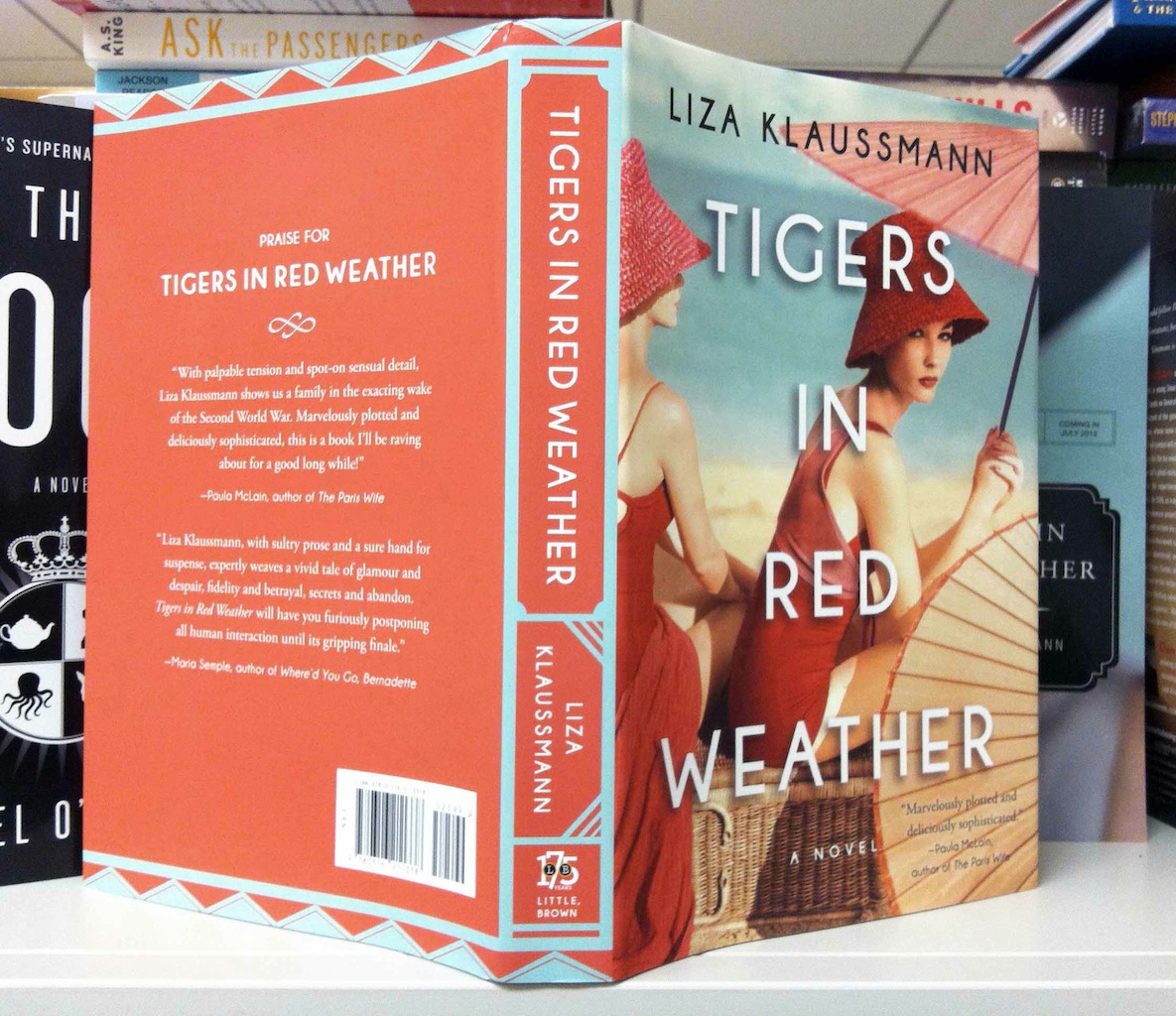
In my first—and somewhat anxiety-producing—face-to-face meeting with the team at Little, Brown to discuss the strategy for Tigers, the proposed cover was finally unveiled. At a big conference table, it was held up for me to see. For a minute, it seemed like all the air was sucked out of the room. But: Hurray! All my fears had been for nought: It was beautiful—somewhat cruel, like the book, and stylized, sophisticated. An image of a woman’s hidden face, a hat brim covering most of her features, and long manicured nails holding a carnation up to her lips. I was in love.

Everything went ahead as planned: a mock-up of the flap-jacket was sent, then the glorious, shiny proofs arrived nestled in white paper in a box at my doorstep. Oh, the ecstasy, the smugness of first love; I was bandying those proofs around willy-nilly to anyone and everyone.
Then came the fall. Several months before the book was set to debut, an e-mail arrived in my inbox saying they wanted to change the cover. I was devastated. There were tears and fits and gnashing of teeth. Judy patiently explained to me that the image they wanted to use was the one my Canadian publishers had come up with—a lovely cover that I had seen and already enthusiastically approved. She said that, by chance and for some time, she’d had both proofs on her desk and everyone who walked into her office liked my wonderful carnation woman, but adored the one chosen by Random House in Canada. I agreed to the change, but—while I knew I was being unreasonable, possibly childish—I was inconsolable.
Break-ups are hard, especially if you’re on the receiving end. But little by little, I got to know my new cover better—the lovely, suspicious, disdainful look in the bather’s eyes, the deep shades of cherry red, the elegant block lettering. And most importantly, the thing that I really came to understand and appreciate: the image made narrative sense. We were already friends and then we fell in love. It wasn’t the capricious infatuation of my first foray, but the slow-burn of a long-term relationship. I recently looked at the original cover again and I realized that beautiful as it was, and as much as I had adored it, it wasn’t my cover. My cover and I, we were meant to be.
—Liza Klaussmann, author
Tigers in Red Weather was originally pitched as “Gatsby-esque.” But really it took place from the 1940s-60s, which is a completely different era of design. I had already read the summary prior to the meeting and knew that I really wanted to work on this book. It was part murder-mystery and part unraveling a tangle of family secrets and lies within high society.
The first thing I did was jump into a lot of research. I had fun going through vintage fashion magazines and books of famous photographers from those decades. I tried something different in that I printed out everything I had and brought it with me to show the editorial team. From there we all went through a process of elimination. We ended up with a gorgeous old Vogue photo from the ’50s. I really liked that the colors added a vintage vibe while it also connected to the title through its red elements: the carnation, lips, and nail polish. And I cropped it in such a way that it would be more mysterious.
Our whole team came to an agreement on this original cover and everyone really loved it, including the author, Liza Klaussmann. I actually got to be there in person when they first unveiled the cover to her, which obviously could’ve been a pretty awkward situation, but thankfully she loved it as much as we did!
Then, out of nowhere two months later, I came into work to find out my boss “has something to tell me.” That’s almost never good. Apparently, a comment came up from a buyer that resulted in us having to completely overhaul the cover. Needless to say, a few of us were pretty upset to have to let go of the original sophisticated cover.
Soon after, the editor, Judy Clain, got a hold of the Canadian cover and the editorial team decided they wanted to use the same photo but put our own type on it. This photograph had actually been in my first batch of Vogue contenders! In the end, I had a lot of fun with the final cover and really enjoyed how the remainder of the book jacket developed from the eye-catching spine that randomly came to me one day.
I wanted to be involved on all levels, so I worked closely with our production team to pick out the colors for the case cover. I even took the time to go to a fabric store in the fashion district here in NYC to find some fun patterns to use as the endpapers on the inside of the book.
I loved Tigers in Red Weather so much that I wanted it to look the absolute best that it could and get plenty of attention. Covers always turn out better when you really love what you’re working on. It is by far my favorite project to date. I also like to think I helped out with publicity by telling anyone who would listen to read this book as soon as possible. Seriously, read this book.
—Lindsey Andrews, designer

This is one book where the cover really helped sell me on the novel (which I thoroughly enjoyed). I first saw the UK cover (a yellow swimsuit) and was intrigued, but something about the expression in the US/Canada photo really drew me in, and I agree it fits better with the story being told. That said, I think the original carnation cover does seem more “Vineyard” to me and so I can see why it might have been chosen. And it would have been perfectly fine, but I can’t say I would have read that book.
Love the cover! The vintage look, the colors, great!! I love reading, but as an artist, the art work on the covers is a big attraction, this is one that would draw me over to it. The red tones with the blue, blue green, and brown paper parasols, just fantastic! I am going to be picking up my copy to read!
Fabulous to hear the POVs of both author and cover designer. The author’s angst is palpable and understandable, but the designer’s final cover solution is absolutely THE one. Classy. But also eye-grabbing, alluring, evocative, suggestive, mysterious in a way that makes me want to read the book. On to that next, best of luck to you, Liza, and kudos, Lindsey!
who took the photograph. Was it inspired from a vogue shoot or was it actually from the vogue archives?
I haven’t seen a copy of the book but when I saw it on talking covers blog it caught my attention. I’ll add it to the growing list of must reads as it looks intriguing. Best of luck with it.
Stunning pic. Love your blog 🙂
Nice play of the colors, all the pink and red with the skin make the image so misterious and beautifull. Something that its so pretty but at the same time can be dangerous, with a dark side.
But i am astonished. It is the image a photography? i thought it was a illustration.