
(Scribner, 2013)
I am fortunate in that one of my colleagues here at GQ is the unbelievably talented Chelsea Cardinal. She had read a draft of my book in the very early stages, years before I even had a publisher. She loved it and enthusiastically told me she’d like to work on the cover when the manuscript sold. When Scribner and Nan Graham bought the book, I asked Nan if she would consider going out of house for the jacket design, and I mentioned Chelsea to her.
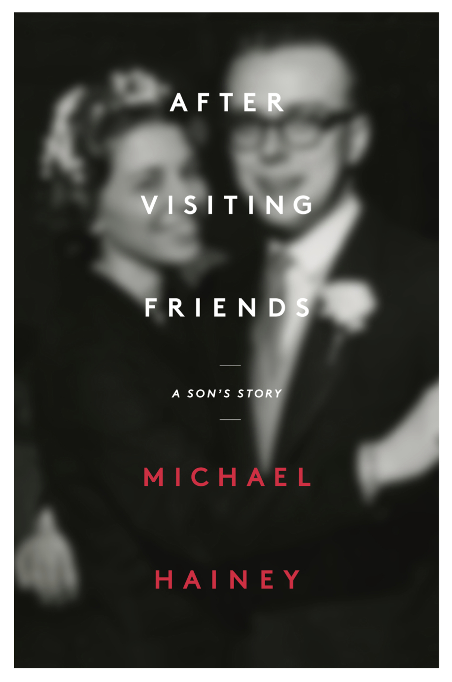
Chelsea and I talked about the jacket a bit, but it was all her vision. She and I looked at a number of archival images from my family scrapbooks. Chelsea felt it was important to use a photo, since that would reinforce that this is a true story.
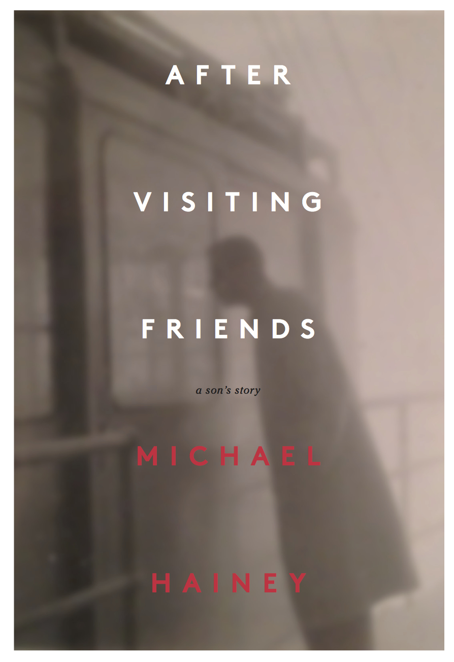
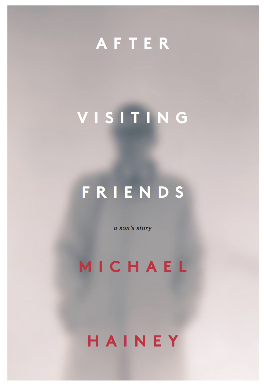
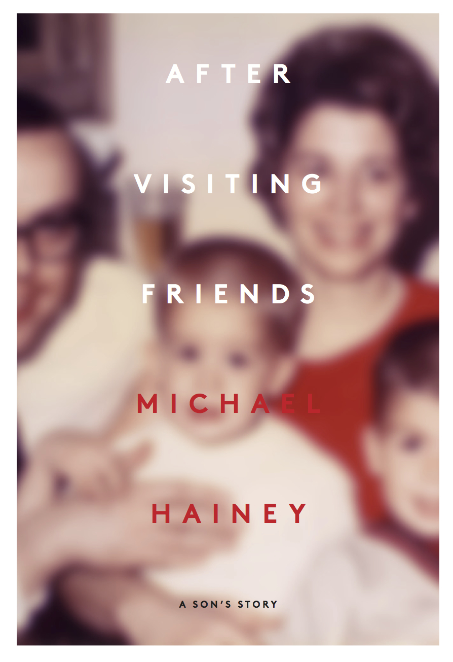
Chelsea created five or so versions of the jacket, each involving treatments incorporating different photos she culled from my father’s scrapbooks. The photo you see on the jacket was one of the photos that we had narrowed it down to. I loved all of the designs she showed me. But when Chelsea showed me this one, we both knew it was the strongest.
The photo is of my mother and father, taken a year before they were married. They are at the wedding of a friend/colleague from the Chicago Tribune. The photo was shot by a man named Ron Bailey, who was a Tribune photographer and had been hired to shoot the wedding. My father was one of the groomsmen. I believe it was 1960 when it was taken. I found the photo in one of my father’s scrapbooks and had always liked it. It shows my parents young and in the midst of falling in love.
Like I said, when I saw the cover, I just knew. Working at GQ with Chelsea, as well as Fred Woodward—they create so much amazing imagery. Chelsea is a master in taking a story and creating a spread in the magazine that hooks the reader and sells the story. It’s an honor to work with her. Working with her and Fred, I’ve had my eye educated to what works and also knowing “it”—a great visual treatment of a story—when you see it.

 A good cover intrigues you. I truly believe it makes you want to pick up the book. It goes back to what I said there about working in magazines—we are so conscious of our responsibility and opportunity to grab the reader each time they turn the page. In a split-second, they come to a story opener, and in that split second, if they don’t see a headline and a deck and a visual treatment that grabs them and intrigues them and provokes them…well, they turn the page and you lose them. Every page is a reminder of the responsibility.
I (and I would believe Chelsea did, too) approached my book jacket with that knowledge: let’s create a strong, arresting “poster” for the book that intrigues a book buyer and makes them want to pick up the book and learn more.
—Michael Hainey, author
Designing the cover for After Visiting Friends was special for a couple of reasons. First of all because the author, Michael Hainey, is a good friend of mine. So there was a direct and ongoing conversation between author and designer that I think must be fairly rare in publishing these days. Perhaps this relationship also imposed more pressure to really make a cover that felt indisputable since we both felt that involving another designer—as happens with books that go through several rounds by different designers before a cover is settled upon—would not be an option here.
The other reason is that I was an early reader of the manuscript, actually reading it a few times, and watched it evolve as Michael was writing it. After my first reading we agreed that I would work on the cover, but that was well over a year, maybe even two, before I would actually sit down to start my sketches. Being one of those who produce their best work under pressure, I decided not to think about the cover too much, not to let any images settle in my head, until there was a deadline in sight.
There are some themes running through the book that in turn drove the cover design. Memories (and their selective nature), mystery, family and heritage, nostalgia, curiosity, inquisition—these last two being the motivation for blurring the photo. I like the way that a blurred photograph engages the viewer. There’s an active feeling of trying to discover more information, a desire to bring the image into focus. As a visual metaphor for a man’s search for answers to his family secrets, a blurred family photograph is very fitting.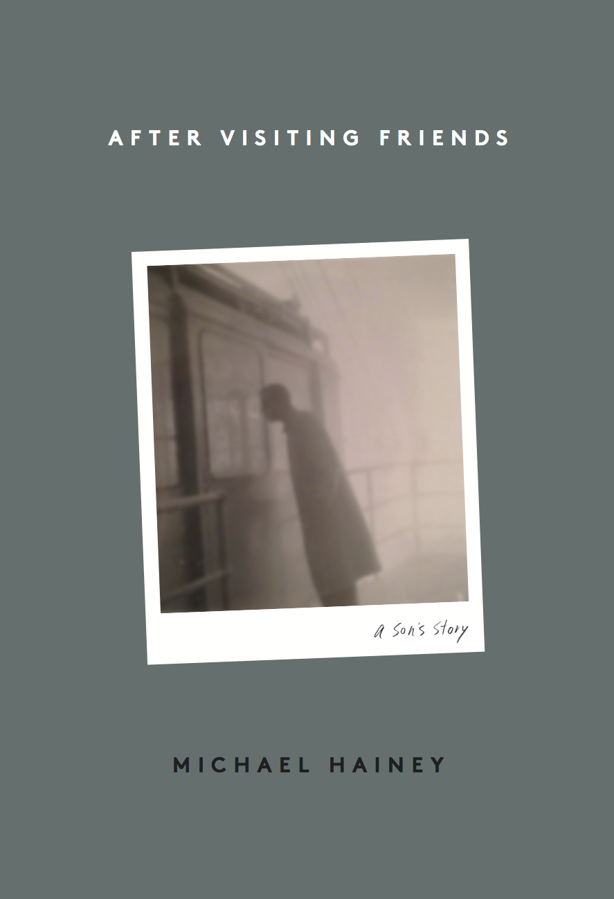
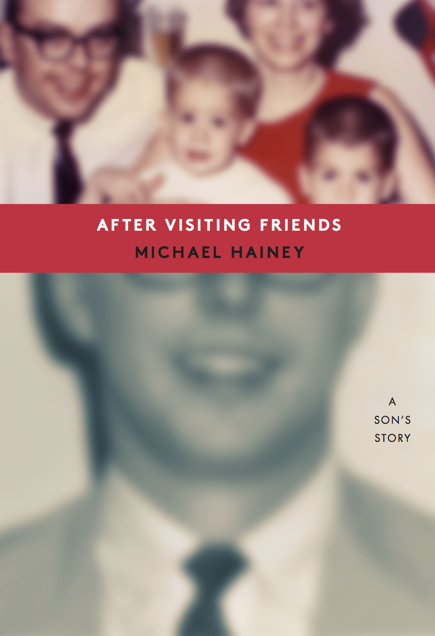
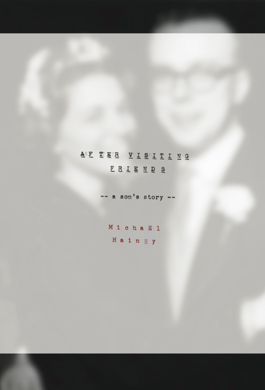 Michael and I had spent some time looking through his collection of family photos and I scanned several of them for potential cover use. There were a few that I tried with the same centered type treatment, but the one of Michael’s mother and father was most alluring and the clear favorite.

Besides old photos, there were odd pieces of memorabilia such as Michael’s father’s Chicago Tribune press passes from the 1960s. I was drawn to these as unintentional design pieces. Solid black type (often Futura) on a bold, flat, primary-colored background.
I like the way Futura has of evoking a vintage aesthetic but was hesitant to further add to the frequency of its use. I chose LL Brown, by Lineto, which takes some personality cues from Futura, but specific details of the characters are quieter and not immediately recognizable the way Futura’s are.
When it came to the production of the jacket, I really wanted the photo to feel like a real photo so I chose a super glossy UV coating which would contrast with the flat white border to mimic a Polaroid print. It’s a nice example of the production adding richness to the design.
I wanted to make a cover for Michael’s book that felt pure and honest, like the story, and I hope I have done that.
—Chelsea Cardinal, designer
