(Melville House, 2011)
I can’t say enough about Christopher’s work—not only with regards to my book, which I adore, but about all of his work at Melville House. I consider him, quite simply, one of the best in the business, and there’s no one I’d rather work with.
My book presented Christopher with a unique challenge, because it’s inspired by another book: John Muir’s beloved automotive manual (of the same title) from the 1970s.
Muir’s book has a very familiar sensibility, and one which I feel evokes a specific era. What’s more, my novel is very strange and difficult to summarize: it tells the story of a man who is a single parent to a Volkswagen, and it features a tree which steals hearts, a character with two sides, and many other strangeities. Before I saw the galleys of my book, I couldn’t help but wonder how Christopher would handle all of this: would he reference Muir’s book directly? Or somehow try to render the strange universe of the book?
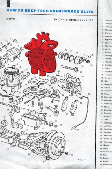
Above all, though, Christopher is an incredibly perceptive reader. His design for my book not only transcended my predictions and concerns; it reminded me what my book is truly about. The story may feature talking Volkswagens and heart-attack trees, but the true inquiry of the novel concerns the confrontation of mystery. The book itself, therefore, is a slightly mysterious object—Christopher’s design suggests a worn manual, and includes a diagram with a heart at its center. To me, the design scheme seems both familiar and strange, both off-kilter and inviting.
I have no doubt that Christopher’s design attracted many readers who might have looked past my book otherwise. I’m indebted to him for this—his impact on my career has been immeasurable.
—Christopher Boucher, author
As soon as I saw the first page of How to Keep Your Volkswagen Alive, I knew I’d never read anything like it before. And when I say first page, I mean first page: the manuscript came with a blurb from the state of Colorado and another from the Daily Thermos heralding it as “a work of consummate rice.” The table of contents is labeled, “At the Morning Tables of the Miss Florence Diner.” In this book, trees are vicious criminals, time is literally money, and the narrator’s infant son is a 1971 Volkswagen Beetle. It is a funny, profound, deeply moving, and weird, weird novel about language, grief, and the unconditional love that comes with fatherhood.
And it is also a car repair manual.
More specifically, it is How to Keep Your Volkswagen Alive, a meticulously illustrated bible of hippiedom published in 1969, which gave Christopher’s book its title and structure. We bought some copies of the original to keep on hand for reference, and while it seemed like a natural starting point for our cover, we wanted to make sure our book still stood on its own—after all, in setting and style it is completely contemporary, to say the least.
In the end, I did what I usually do, which is to steal an idea for the cover directly from the manuscript. In this case, the narrator’s son—who, again, is a car—has a heart in place of an engine, so I printed off an image I found online and showed it to our publishers:
“It’ll be like this exploded diagram of a car, but with a heart in place of the engine.”
“OK!”
And then I just had to figure out how to make it work. Not knowing much about cars myself, I downloaded a bunch of service manuals, studied the illustrations, and identified parts that could conceivably (within the realm of this fictional universe) connect to the valves of the heart. Many hours of pen-tool-ing later, I had something that seemed to capture what the book really is: a service manual for the human heart. As an extra joke, in keeping with the synesthetic shapeshifting that takes place throughout the narrative, the parts identified in the legend to the diagram would all be body parts: appendix, liver, gallbladder, etc.
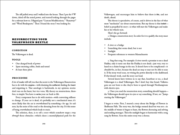
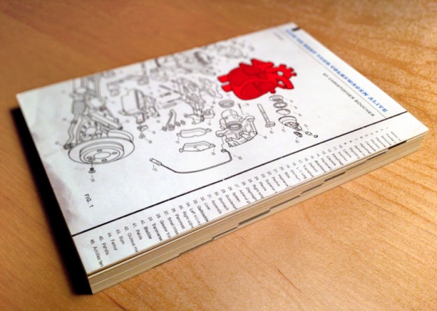
At the risk of talking about more than just covers, we carried the conceit into the book’s interior as well: key words (“transmission,” “clutch,” “promises”) are bolded, chapters open with bulleted lists of the tools required for the emotional procedures that follow, and black tabs in the outer margin mark your place—you can see them on the face of the book when it’s closed, which really completes the effect.
When Christopher saw what we’d come up with, he wrote in to say his only concern was that he’d be breaking the time-honored tradition of authors objecting to their covers. Since then I’ve been lucky enough to cross paths with him a few times, and he is truly one of the kindest and loveliest people I’ve ever met. This Christmas he sent us gingerbread cookies, and in the box we found a series of heart-stoppingly adorable photos. They were of his newborn son, who is not a car.
—Christopher King, designer




That is one gorgeous and unique cover and book design; thanks for the article!
…but I WISH this blog had an RSS feed (yeah, I’m one of those people whom Google just declared to have died out with the coelacanth).
… and by “coelacanth,” I of course mean “trilobite.”
wonderful post, very informative. I ponder why the other
specialists of this sector don’t notice this. You must proceed your writing. I’m
sure, you’ve a huge readers’ base already!