
(Little, Brown & Company, 2012)
Soon after I sold Where’d You Go, Bernadette, my editor, Judy Clain, and I had the book jacket talk. I told her I wanted a bold, graphic cover. I then proceeded to jam her inbox with images of beautiful book jackets I wanted mine to be nothing like: ethereal women walking down gauzy paths, the sides of clapboard houses with peeling paint, the edges of windswept oceans with tufts of wispy grass, colored-glass bottles with sunlight twinkling through. Judy kindly told me she got my point, and not to fret, that she had Keith Hayes on the job.
A month later, I was at my computer and an email came through. The subject line, FWD: WHERE’D YOU GO, BERNADETTE. I immediately knew it was my cover. I forwarded it to my boyfriend, George, and went into his office.
“I just e-mailed you my cover,” I said.
He jumped up, all excitement. “What do you think?”
“I haven’t looked at it. I want to have a moment of silence first, because I know my novel will never be the same.”
To authors, novels are a years-long head-swirl, manuscript pages printed on the back of menus, scenes scratched out on yellow pads, scraps of paper on the side table with a good word written on it, heaps of frustration, brain-bruising concentration, constant doubt. Seeing your jacket for the first time is the moment when you fully comprehend that what was once a private funhouse is now public. It’s a momentous and surreal shift.
George and I closed our eyes, took a breath, and opened the PDF.
Instantly, a smile hijacked my face. The image was so bold, the oversized dark glasses so iconic, the colors so fabulously off. It was like nothing I’d ever seen. As I write this, I’m looking at the cover, and I can’t get that same smile off my face.
There it was, my book. There it is, my book.
These days, almost everybody I talk to about Where’d You Go, Bernadette mentions its eye-catching, joyful cover. Booksellers flat-out tell me they think the book is selling so well because of its cover.
Now, when I think of Where’d You Go, Bernadette, I can barely access the years of doubt and frustration it took to write it. I only think about Keith Hayes’ terrific cover. And I can’t help but smile.
—Maria Semple, author
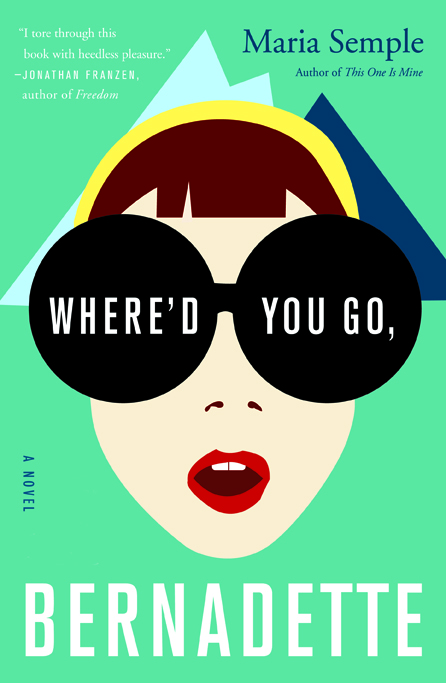
Maria’s book was pitched to us as a comic novel set in Seattle about a mother that goes missing. The only request for the jacket, that I can remember, was to have a strong, colorful, graphic text design. Images of St. Bernadette, Seattle, Antarctica, a ship porthole, etc., were offered as suggestions at our weekly jacket meeting. I quickly jotted everything down hoping to make sense of it all later on.
After reading the manuscript, I thought that designing the cover was going to be a bit of a challenge. Up to that point I don’t think I had worked on a comic novel.


I also really loved the book. That can sometimes create a bit of apprehensiveness before I actually sit down and start designing.
The best way for me to work is to clarify, right from the beginning, what I want the jacket to say. I wanted it to be obvious to the reader that this is a satirical novel. Funny and accessible, but also smart and literary. I made the decision to go in a more illustrative style as opposed to photographic. I kept going back to the request of having a strong title type treatment. Originally I liked this idea. I thought I could do big, hand-drawn type with some smaller spot illustrations. As I worked up some rough sketches I realized that something just wasn’t quite working. It just didn’t have any impact. I kept repeating the title over and over again. It reads like a question, so I did find it a challenge to work with.
It didn’t take too long to figure out that I was going to completely ditch the mostly typographic idea. I was thinking of a simple image that would come off as comical and that would resonate with this quirky title. I was trying to avoid putting Bernadette on the cover. I just thought it was too literal. I also couldn’t imagine it looking original. But I thought about Maria’s description of Bernadette. I thought that I could pull it off in a fresh way using simple, graphic shapes. Normally, I would hire an illustrator for this but I had no clear direction to give them. I didn’t know where the type would fall. This I needed to do myself. The inspiration for the illustration is pulled from a scene in the book.
The approval process on this project was much smoother than many of the books that I have worked on. I think besides for an earlier round where I rendered Bernadette in an odd way, this got approved immediately thereafter. After I presented it in a jacket meeting, Judy Clain, the book’s editor, sent it off to Maria. I don’t remember exactly what her response was, but I do remember that she loved it.
Maria is an amazingly talented author and a wonderfully supportive person. I look forward to the possibility of working on her next book.
—Keith Hayes, designer

This cover is genius; it really makes me want to read the book. I love it and love the color combination.
Fabulous cover–it’s almost always the cover that draws me to the book–and I enjoy hearing the story behind it.
I love the use of the simplistic geometrical forms, it creates a bold and powerful message to the viewer. But at the same time a hint of whimsy is still present. Really hit the jackpot with this one!