

(Riverhead Books, 2012)
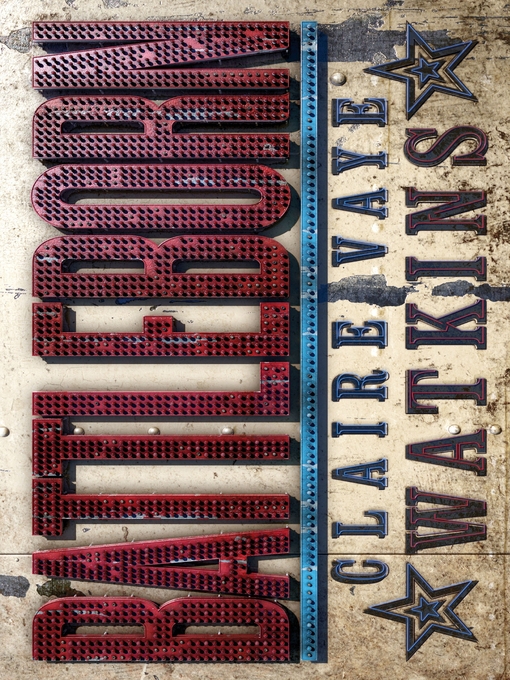
The cover Americans see is the first and only cover for Battleborn that Riverhead Books ever sent me. I loved it immediately, and said so immediately, and that was that.
My foreign covers were a different story: Lots and lots of neon lights on Battleborn abroad.
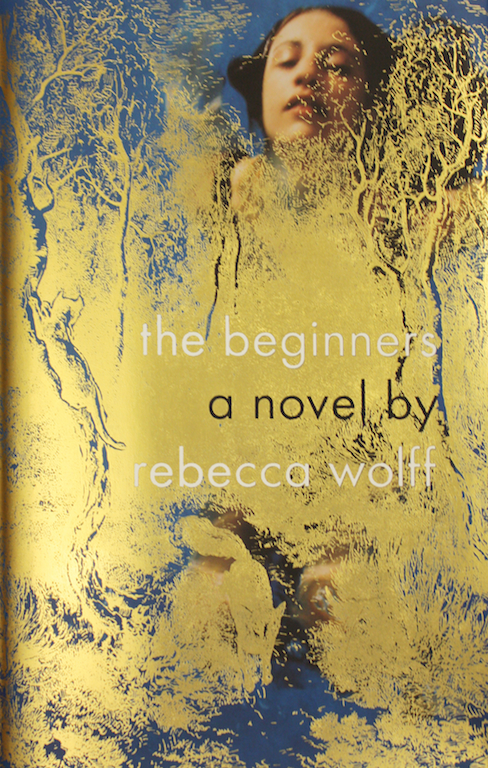
Initially, I resisted the UK cover for no more sophisticated a reason than it seemed so very familiar: a book about Nevada with a neon sign on the cover. Wah-womp. Along with a road stretching off into the distance, it was one of the images I most dreaded. But Michal Salu, the designer at my UK publisher, Granta Books, assured me that the design would be fresher and more evocative to a European audience not so inundated with imagery of the American West. Ultimately, I had to trust him on this. And this version does have an excellent texture.
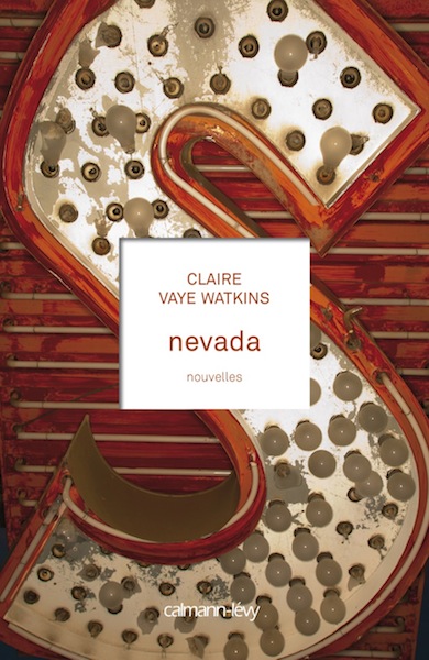
The French cover for Battleborn—called simply Nevada in France—features neon, too, though the vibe is not so gritty. Why an ‘S’? Good question! I don’t know.
Call me an ugly American, but my heart belongs to the US cover of Battleborn. The image looked like Nevada to me, reminded me of the Mojave Desert homestead where I was raised, and where my parents’ ashes are spread. I love the foil type, which evokes silver mining and the way its decadent, toxic legacy is dusted throughout the stories.
My absolute favorite element of the book design is under the dust jacket, where my initials are stamped in foil.
I love the way a reader might uncover this, as so many characters in Battleborn are unearthing shimmering surprises.
—Claire Vaye Watkins, author
I’ll start off by saying that I loved these stories, and I’m proud of this cover because I feel it does what it’s supposed to, which is communicate the feeling of the book.
I think I’ve realized over time that I’m an emotional designer. I kind of hate to say that because I think it may touch on some gender issues in design. Maybe there’s a better way to say it, but what I mean is, my number one interest—besides making something beautiful and hopefully unusual and, well, good—is to communicate the way something feels. Its essence. I think that’s why I got into designing book covers. There’s so much to communicate! And since I have no content of my own I’d like to share with the world—the thing that makes me definitely a designer and not an artist—I’m very interested in trying to communicate words and ideas with images.
That is why I love design, and that is why I love designing for stories. I’m amazed at what a good writer can do. We all know this, how you can be taken somewhere with words. How you can live through someone else and have your own life revealed to you at the same time.
Claire’s stories really surprised me. The sheer force of them was unexpected. They are brutal and beautiful and human. That is really what I wanted to get across: the beauty and the brutality of them. The landscape, the setting, play as much of a role as the characters. In fact, I would say the landscape is a character here.
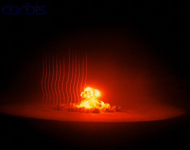
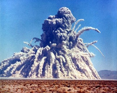
There were many things about the stories that resonated, and looking back through some of my old sketches, I see myself struggling to do something with those themes. One of the things that really struck me was an image from one of the stories, I don’t remember which, of the repercussions of the underground nuclear testing that was conducted in Nevada. Claire talks about the fact that the population is breathing silver dust as a result of the explosions. My lungs felt heavy reading that. And this for me was a moment where the characters are literally breathing in the landscape. The fact that silver is a precious metal, that it’s beautiful and yet it is causing the characters damage—I felt like this could be something I could use. The question was how.
I found a lot of images of the explosions, thinking it would be a nice way to show the power of the writing as well, but somehow nothing came of it. It was missing the feeling. It could have been powerful, maybe, if I could have figured out how to use it right, and yet it was somehow lacking.
I also see a bunch of images of rocks that I tried to use. They are interesting but cold.


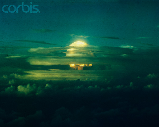
I have to admit, it took me a while, but I kept coming back to this image of the silver dust in the air entering people’s lungs. And finally I got it somehow. The image just sort of appeared in my mind, probably while not sleeping one night. (This is not usually how it happens for me. I don’t generally have this eureka moment. Most of the time I come to my designs accidentally while trying to do something else entirely.) I wanted the type to be made up of silver particles and then dispersing throughout the cover. It would be beautiful, because it’s silver, and yet after reading the story, the reader would realize that it’s actually ominous.
I thought that overlaying the silver type on top of a striking photo of the landscape would be the perfect solution, and that could be the somewhat unusual part: the way the silver would interact with the blue sky. It took some time to find the right image, but I think this one is better than I could have imagined. The way that cloud floats over the ground, both beautiful and yet looking like it could fall down and crush you any minute.
The most interesting part to me is the way the different blue-gray values of the photograph interact with the lights and darks of the silver foil when the light hits it. Sometimes the silver just radiates light and jumps off the cover, and sometimes it recedes or turns darker than the image. Maybe not the best thing for readability but certainly an interesting and maybe a somewhat magical effect.
Looking at some of my latest covers, I notice that I’ve been using a lot of foil.
I used to reject foil almost completely, thinking it decorative and not ‘design.’ But now I actually find it to be an exciting element to play with if used in an unexpected way. In this case, I wouldn’t have been able to achieve my concept without it.
—Helen Yentus, designer
That picture, as most of mine are, was a rather offhand moment. I looked out into the wash from my house in Twentynine Palms, and because that cloud was so big but the sun so bright, it was making a miraculous light in the desert. Like anyone would, I thought I’d take a picture. It didn’t capture the light per se. But some kind of light and some kind of sensation got transmitted, I hope.
The picture has also been used on a 45 by an indie band called CB Brand. And I just saw it in a shelter magazine on the wall of an extremely glamourous art deco inspired apartment in Paris that couldn’t have been further from the desert shack-subject matter of the picture.
I haven’t read the book but judging from the cover it’s excellent.
—Jack Pierson, photographer
