

(Farrar, Straus and Giroux, 2011)
Why do we, in our time-starved moment, still appreciate the media that ask for your time? Take as a principle, for a second, that novels live in time the way films and music do, asking you to spend an iota of your human existence with them, while paintings or photographs live the way many poems do, asking you to respond with the least verbal part of your animal hindbrain to the immediacy of an image.
Coming from this consideration of time-based media, a first premise, I was curious to see what a book designer would find in Lola, California, a novel which contained all that I had known while growing up: the strange dark sexuality of California and our particular dystopian moment; the criminal glee and possibility of young friendship; the syncopation of memory within the relationship of a novel’s characters to their readers; how time feels to Vic Mahler, a man on death row and hence confined, as Alice James put it, to a room of last gestures within a state that offers you the endless potential to escape on a long ribbon of highway.
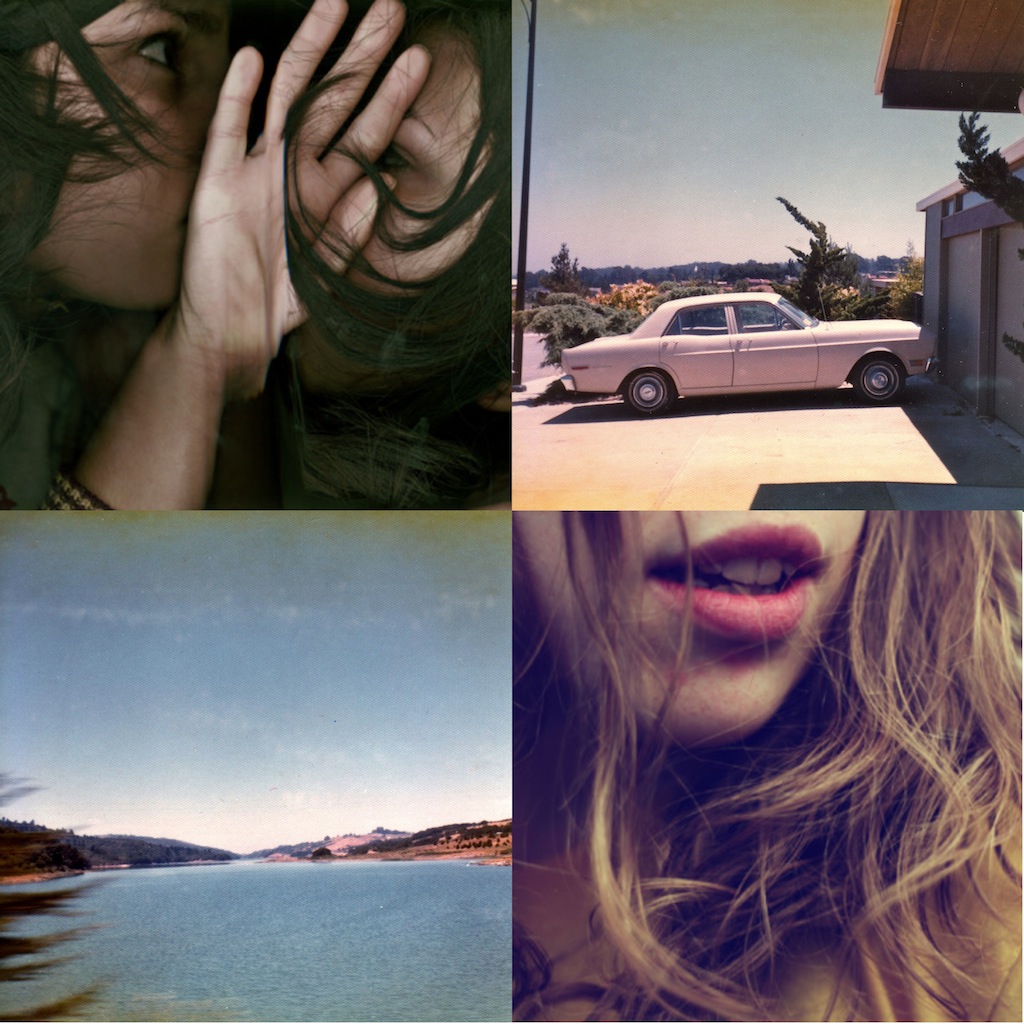
What faulty memory reminds me I may have sent on to Jennifer Carrow, the talented designer: some images by a friend, the New York photographer Dana Hoey, with an undeniably Northern Californian vintage, of a girl on a beach, and a movie she made of two teen girls frolicking in a wading pool; some images by Dafney Dabach of Highway 5, the vast, lonely north-south artery, forgotten by history and grand picturesque state plans, that connects the two hemispheres of the Californian consciousness; and perhaps a few other items.
I was intrigued that what came back was, on the rear cover, a perfectly anonymous photograph of one of those anywhere zones of California; a suggestion of smoggy light lifting off the back of mountains which could have been the Grapevine, an area mentioned in the novel, just north of Los Angeles, bordered by two factual, strangely placed palm trees and, in the foreground, a playground, a parking lot, an abandoned cipher into which you can either interject or lose yourself. In other words, exactly the kind of place memory moors and stumbles. You feel as if you have been in this place, you just can’t recall when or where or why it mattered, a state which imposes the constraint of eternal choice on its denizens and practitioners, in much the same way California does, the name itself a confection from an imaginary place in Don Quixote, the very first novel (or perhaps from a much earlier text; disputes reign, as they do with such slippery referents; cf. the note below this).
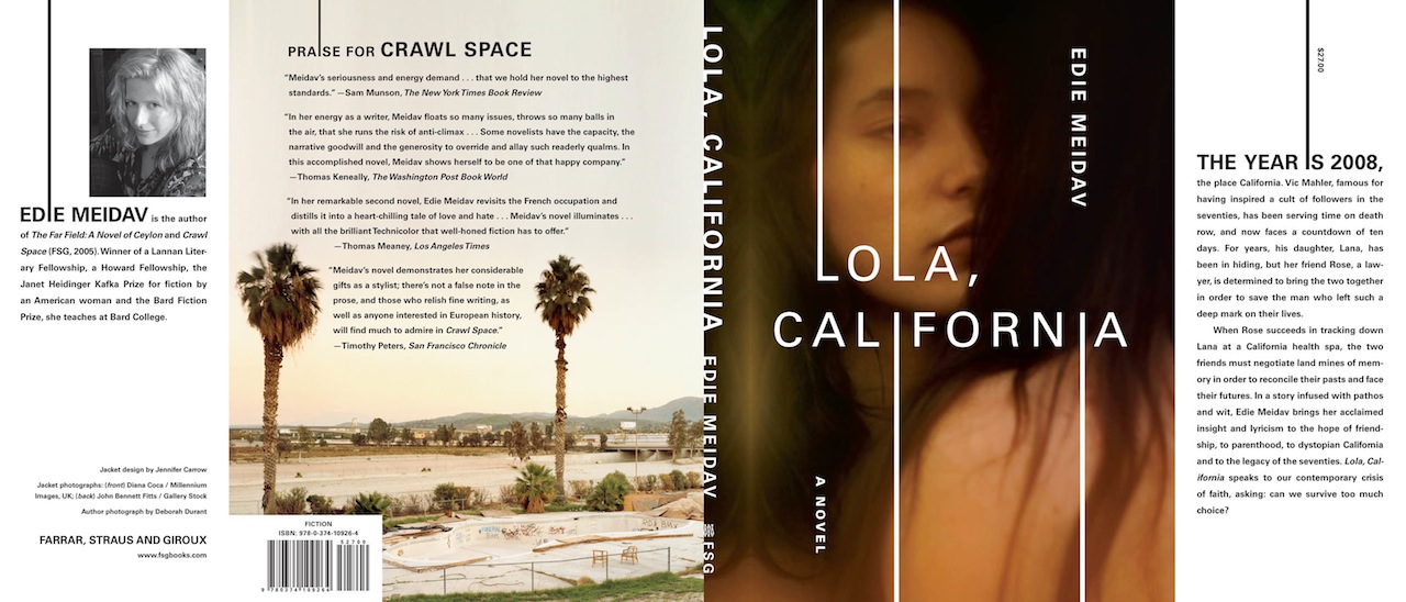
Since the title Lola, California refers to this impossible place, one that doesn’t exist, belonging to two girls once called Lola, I appreciated the blankness of the back, and then when I saw the front, the sepia-toned mystery of one girl’s almond-eyed gaze at another’s, so close but so unseeing, looking over one’s shoulder within the kind of light Rembrandt would have appreciated, I felt with animal instinct this cover was the right one, a kind of outtake from a Kerouac film if made by Cassavetes, while also appreciating the strange ripping of the text from the Ls to the Is, with its bleeding, graphic intention.
As for others’ response to it? A few booksellers have told me they liked the cover a great deal, while a few readers have said they were thrown off by the title and cover into thinking the book was chick lit, whatever that really might mean or should mean in a more utopian universe.
No matter; for me this cover is forever tattooed inside my consciousness, and seems to signify that possibility of friendship when both body and mind are mutating rapidly within a state so dedicated to change. As a title, Lola, California means to me that you might be left, finally, with only sepia-toned memory as your last and best tracer, and this cover seems to offer the same hungry mystery.
—Edie Meidav, author
After reading the manuscript, I immediately began searching for ’70s and ’80s photographs of California. A few gems turned up on Flickr, but nothing felt quite right.
Before presenting any designs, an e-mail arrived from the editor suggesting that we show the two female characters on the jacket. I broadened my search and stumbled upon this great (not vintage, but ’70s-inspired) Diana Coca photo. It had the perfect mix of tension, secrecy, and intimacy that I was looking for. The softness of the photo begged for some crisp typography. The design came together rather quickly, and my hope was that the extended letters would hint at prison bars or at least the idea of something doubled or trapped.
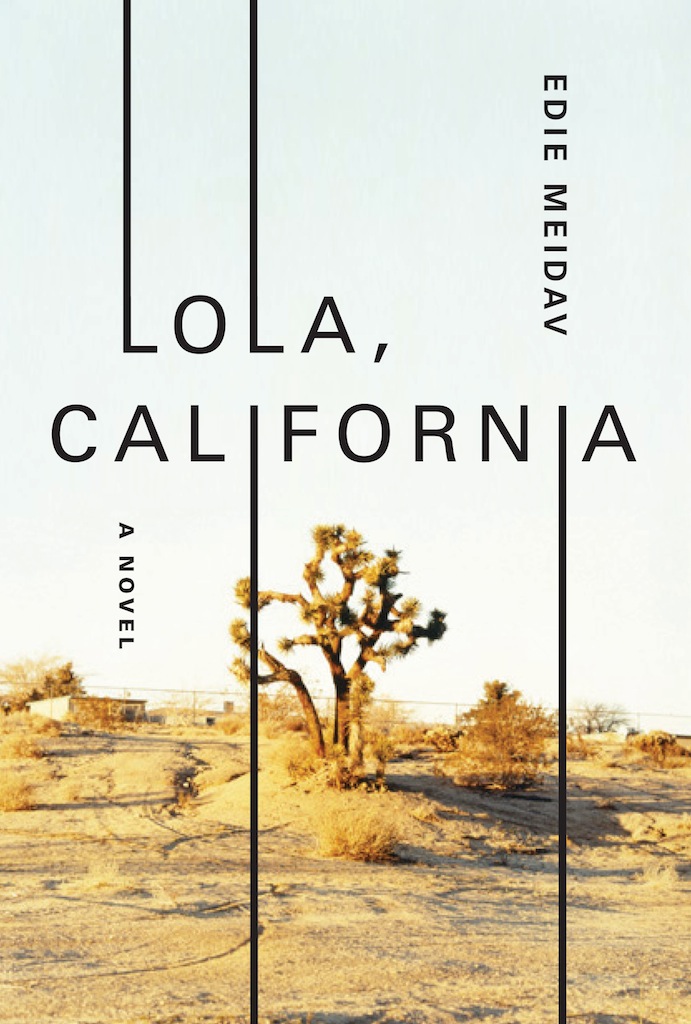
The jacket was brought to a meeting as a full wrap, since I just wasn’t ready to give up the California landscape. I thought this sunny, bleached John Bennett Fitts photograph contrasted wonderfully with the two dark women. It was approved in-house and then went off to the author.
Meidav was great. Her only request, which I was happy to make, was to brighten the front photo slightly. I hope I’ll get to work on her next book.
—Jennifer Carrow, designer
This photograph was taken during a Ralph Gibson workshop in the PHotoEspaña photographic festival in Madrid, 2003. For the master classes we had the luxury of five gorgeous naked models. Most of the photographers decided to focus on the sexual fact of their nakedness. Instead, I was interested in capturing their feminine attitude and thoughtful-dreamy attitude, which models have eventually when they forget about us.
—Diana Coca, photographer
