
(McSweeney’s, 2009)
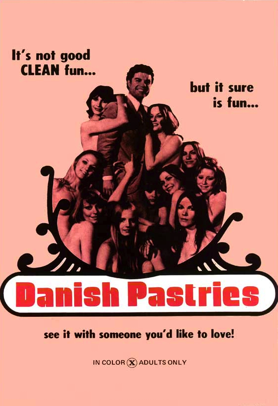
Toward the end of editing God Says No, Eli [McSweeney’s editor/designer Eli Horowitz] and I started talking about cover ideas. I sent him a slew of lurid images from a book called X-Rated: Adult Movie Posters of the 60s and 70s, stuff with titles like Danish Pastries and Put Out or Shut Up, which seemed to irritate him, mostly because of the size of the images, which I think clogged his inbox.

So at a certain point he showed me the work of a couple of different illustrators, and we decided on Kevin Christy. I think Kevin had some disturbing and vaguely religious paintings in his portfolio that we found graphic/compelling and thought would be a good fit for the cover.
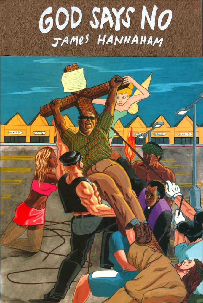
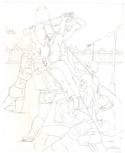
A while later Eli showed me Kevin’s sketch, based on Peter Paul Rubens’ The Elevation of the Cross.


I was a little mystified, honestly—referencing such a high-art source seemed far too tasteful for the tacky southeastern atmosphere I’d meant to create in the book, which is about a closet-case GBM from South Carolina who cheats on his wife in public bathrooms, among other things. But in the interest of speeding the process I thought that the image could be tweaked to represent the book a lot better.
I don’t remember whose idea it was to move the crucifixion of the main character, Gary Gray, to a strip mall parking lot, but I continue to applaud that move. Mainly, I pushed for heightened tastelessness; I wanted a kind of Sgt. Pepper’s-style melange of the various oddball figures who appear in the book. I don’t remember if it was me who suggested that Jesus participate in the crucifixion, but the audacity of it still amuses me.
I thought people would be sort of appalled by the cover, actually—it’s fairly offensive if you actually grapple with the content of the image. But I never got any complaints, not even from booksellers.
Eli was doing this “short jacket” thing on all of the book jackets that year. The “Horowitz jacket,” we ended up calling it.

 I forget the practical reason he gave for doing it, but I loved the interplay between title on the hardcover of the book and the paper/image of the jacket; like a lot of McSweeney’s fare, it calls attention to the status of the book as an artifact. Writers, probably more than any group, tend to think of books in physical, sensual terms. So in that regard, I consider myself exceptionally lucky to have a first book (a hardcover!) come out with a publisher that cares so much about making exquisite and distinctive (if occasionally tasteless) fetish objects.
—James Hannaham, author

I’m no good at actual graphic design and only decent at book design. My only real advantage is that I also edit the books I design, and so by the end of that year or two I’ve really got the novel in my bones. In the case of God Says No, James managed to pull off an impressive combo of high and low; amid all the Waffle House bathrooms and mundane humiliations, Gary Gray persists and even triumphs. It’s a heroic journey, beset by tribulations on all sides.
Meanwhile, I had recently been editing Lawrence Weschler’s terrific Everything That Rises: A Book of Convergences, which frequently joined iconic paintings with incongruous modern parallels, so I guess I had that on the brain, and somehow I seized upon the Rubens painting as a starting point. (A clever trick for compensating for my design weaknesses: steal from the 17th century!)
I’d worked with Kevin Christy before, and I knew he had both the classical drawing skills and a certain bright, fleshy style—a perfect fit for the project.

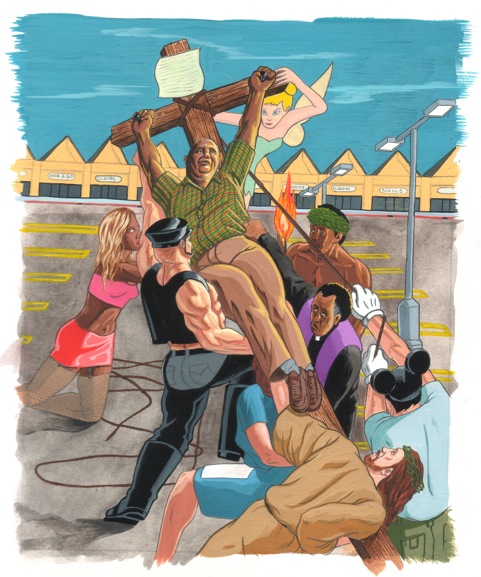
He and James did a lot to push my hazy high-concept mashup toward actual realization. James was deeply involved throughout, pushing us to go bigger, tackier, trashier. (One note from him reads, “Hey Eli. Can one of the figures hoisting Gary onto the cross be Mickey Mouse, dressed as the Sorcerer’s Apprentice?” Another: “In an ideal world, the fire dancer would look a lot more like Mario Lopez.”)

I love the three-quarters jacket in general—it presents lots of fun design possibilities, but still any printer can manage it, with no added expense. It allows for the poppiness of CMYK printing, including necessary practicalities like barcode, blurbs, promo text, but also points towards the book’s long life after the moment of purchase, once all those things become irrelevant and the jacket eventually falls to pieces. I don’t know why people don’t use it more.
—Eli Horowitz, editor/designer
I came to the project through the art director at McSweeney’s, Eli. He had seen my work at a show in San Francisco and I had appeared in a few of their books in the past. He already had the concept in mind when he contacted me so really the experience was all about getting it to a place where the author hopefully liked it. (I don’t know if he did or not.)
It’s basically a spin on a Ruben’s painting adding contemporary characters that inhabited the book. My take on the book was that it was beautifully personal and I just wanted to lend whatever I could do to hopefully engage people into picking it up and reading it.
There were minor tweaks from James about the way people looked, etc., but nothing major, and the process with Eli is always pretty easy.
I sent the original to James and that was that. The local bookstore I go to in Los Angeles, Family, has a copy where you can see the cover on their shelf and I always like seeing it out there in public.
—Kevin Christy, artist

Very interesting sketches! How did you come up with selecting the Ruben’s painting rather than other artists?
How do i like this page…very interesting
An excellent example of why I read almost no fiction, whatsoever. The only thing possibly more pointless and completely idiotic than reading about imaginary people doing imaginary things is reading about imaginary degenerates doing imaginary, disgusting things.
Interesting. I love the mix of high and low, and I really am attracted to the look and feel of the 3/4 cover. And WOW – I have been trying to think of the title, The Convalescent, for ages, so I felt amazed when I saw Eli’s cover design here. I read half the book, and somehow got parted with it. It’s a name I forgot and has been haunting me for years as I tried to recall it. The many odd google searches I’ve done… Thank you!
Interesting. I love the mix of high and low, and I really am attracted to the look and feel of the 3/4 cover. And WOW – I have been trying to think of the title, The Convalescent, for ages, so I felt amazed when I saw Eli’s cover design here. I read half the book, and somehow got parted with it. It’s a name I forgot and has been haunting me for years as I tried to recall it. The many odd google searches I’ve done… Thank you!
Reprobate. Disgusting.
Why would insulting another person’s beliefs be amusing to you? I am not white but I would never disrespect white people in the name of being artistic or amuse myself. I am not Gay but I would never make fun of Gay people no matter what. Now why would you celebrate that your book has a front cover with the picture of Jesus crucifying someone else. It’s unfortunate. No Christian insulted you, Jesus didn’t do anything to you but you just woke up one morning and decided that insulting and disrespecting other peoples belief’s would be a good idea for a book cover. What do you think that says of you as a person? Change. Being inconsiderate and hateful is not the way.