
(Hyperion/Voice, 2012)
No matter what cover I’m given, there will always be an initial period of panic because whatever my designers come up with will (of course!) not match the image I held in my mind for years and years. For Arcadia, I’d decided the cover would be an updated version of the frontispiece of Sir Thomas Moore’s Utopia: woodcut-like, but with a brick Arcadia House in the center and maybe a caravan in the place of the boat.
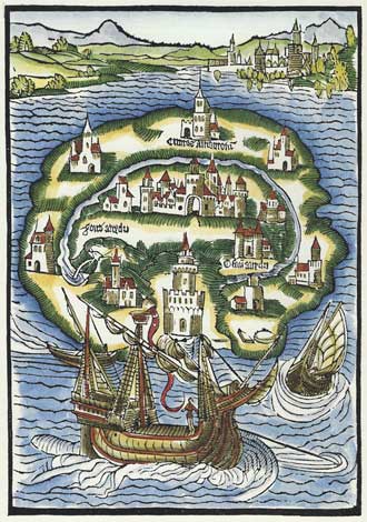
I loved the sly nod at copulation implied by the original, and thought it’d be both witty and beautiful. Alas, I have always offered my strong opinions to my editor, and my opinions have always been listened to in a polite manner, but they have always been ultimately ignored. I’m sure that’s for the best. I haven’t been trained in cover art, and cover designers do know what sells.
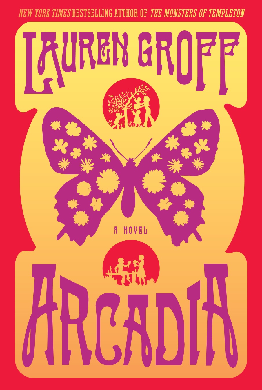
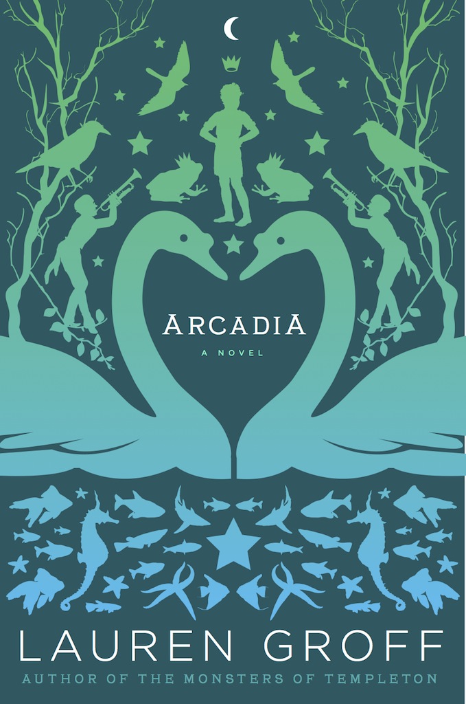
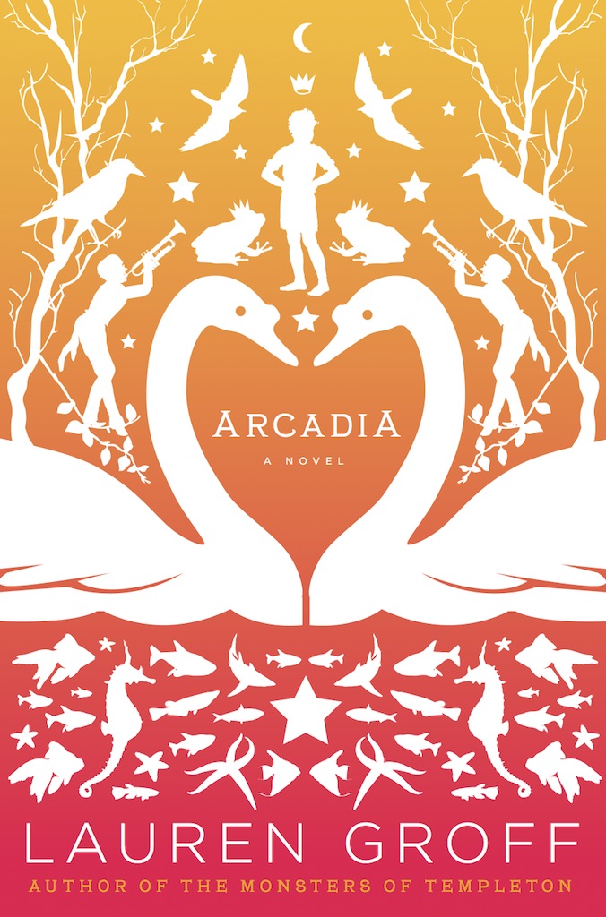
In truth, the first time I opened the PDF of Arcadia, I had a nervous breakdown. It was so BRIGHT. So, so HIPPIE. My book left the realm of hippiehood at the exact middle of the narrative, and I felt the 1970s music poster effect limited the scope of the book. My idea was to work against the lazy stereotypes of hippies that we are bashed over the heads with over and over again on television and in the movies, and it felt to me at first that I was given a stereotype of a cover, reinforcing the exact thing that makes me bridle so much.
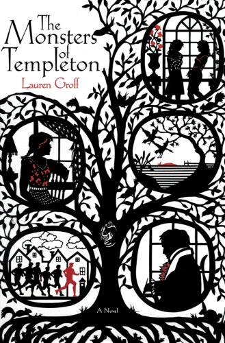
The silhouettes, while a nice nod to the scherenschnitte cover for my first book, The Monsters of Templeton, felt a little clip-arty to me, as did the butterfly, which has some kind of significance that I still am not clear about. I tried to get them changed, but I was politely ignored. I tried to get the color palette changed to green and gold and blue, feeling that from afar the book looked like a puddle of melted sorbet; but again, was politely ignored. I wept and gnashed my teeth, to no avail. The book came out. And people tell me every single week that the cover is stunning and startling and so very beautiful.
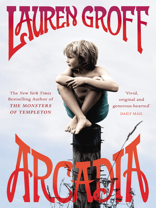
By now, years after I first cried over my cover, I have come around to believe in the genius of my cover designer, to such an extent that I am now profoundly disappointed that the cover didn’t carry over to the paperback (which, alas, has a cover I don’t love as much). Now, the US hardback cover ties both of my beautiful UK covers (paperback and hardcover) as my favorites.
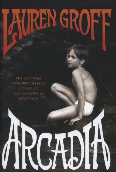
Even with the US paperback, though, to be a woman writer and not be given an insulting cover of a depersonalized woman—the back of a woman’s head, her feet, her headless body, her hands holding something sweet/disturbing—well, I chalk that up as a moral victory. (Onward!)

—Lauren Groff, author
Laura Klynstra, art director at Hyperion Books, contacted me about working on a new cover for her. Laura and I had previously worked together years before at HarperCollins, where she ran the Amistad imprint and the audio division. We had collaborated on numerous covers over the years, including her art directing me on this one:
For this new project, Laura wanted me to tackle Lauren Groff’s newest novel, Arcadia. Lauren’s previous novel was The Monsters of Templeton, and sported a silhouette-themed cover. I think due to my extensive work in silhouettes, Laura thought it might be a good pairing.
Arcadia is set in the ’70s and tells the tale of Bit, a small and sensitive boy who was born on a commune and knows nothing of the outside world. Bit eventually comes across a copy of Grimm’s Fairy Tales and is immediately enthralled by it. He begins to envision himself as the sister in the Swan Brothers story. The story continues as we follow Bit’s life as he grows up and leaves the commune.
We knew initially that we wanted to try some comps with silhouettes to mimic Lauren’s previous novel, but Laura was also very interested in making sure that I try some designs with loud, bright, almost neon colors in order to reference some of those psychedelic posters of yesteryear. I had the goal to make it look “groovy.”
I tried a handful of designs.
One of my favorites was a symmetrical and vaguely mystical-looking silhouette design where Bit is front and center amongst swans and other animals—in some ways, a visualization of one child’s imagination.
In another, I tried for more of a literal adaption from her previous novel, where everyday life scenes on the farm were shown in a panel format (much like The Monsters of Templeton‘s vignettes), although I used a very bold-colored gradient in the background to make the cover look a bit more modern.

In what would become the base for the final cover, I designed an pseudo-Art Nouveau poster meets a ’60s/70’s rock poster (which is sort of one in the same, in many ways), complete with bending letterforms and a butterfly silhouette filled with flowers. I figured, What could possibly say hippie more than a butterfly made of flowers!
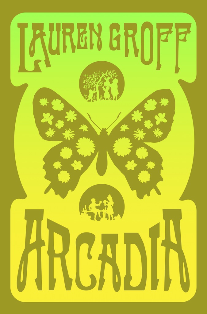
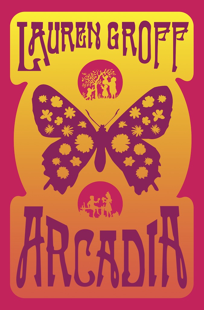
Initially, I presented two color options on this concept. A fluorescent yellow/green with copper foil, and an orange, magenta, and purple cover which we would end up going with. If I recall, the final cover ended up being a bit more red than magenta, due to some sales feedback, but nonetheless, the cover turned out quite nicely, and as always it was a pleasure to work with Laura Klynstra, who is by far one of the best human beings that I’ve met in publishing. Also, on a side note, she makes the world’s best sugar cookies. Like ever. I’m totally serious.
—Will Staehle, designer

This design concept reminds me of lithograph prints used in Germany around the beginning of the 20th century. I think the connection between the plot of the book and the youth movement towards freedom and independence in German expressionism is a really great parallel. Very well thought out!