

(Penguin, 2013)
Being an artist and a writer, I had a specific vision for the cover of Glow: stark, strong, and allegorical, with a dash of mysticism, enticing readers to flip open the flaps and discover the mysteries held inside.
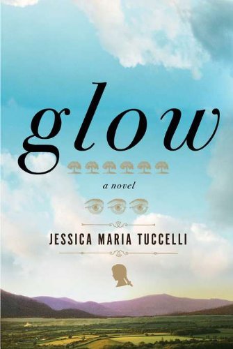
Glow is a multi-generational family saga that takes place in a small town in the American South over the course of one hundred years. The main characters’ narratives spring back to a fictional progenitor, the great Solomon Bounds, pioneer and slave-owner. I found myself imagining a silhouette, perhaps of a wood cut of Bounds’ great-granddaughter, her hair wild in braids, her neck morphing into the trunk of a chinquapin tree with many roots, a symbolic family tree.
My editor and I discussed ideas for the cover, and afterward I sent her images by Kara Walker in hopes that the designer would use them as a springboard. Walker is an American artist known for her cut-paper silhouette installations, which she uses to explore the complex intersections of race and history, with a special focus on antebellum South.

When I first saw the trade paperback of Glow, I’m embarrassed to say that tears of joy sprang to my eyes. For the hardcover, my publisher had shied away from the Kara Walker images, presenting me with various iterations of striking landscapes, emphasizing the scope of the saga and the land in which it takes place. But for the paperback, they went for it.
Sara Wood, the designer for the trade paperback cover, created an eye-grabbing visual—the chinquapin tree emerging out of the girl’s head, the fallen leaves forming the outlines of her braids, the canopy creating a halo or “glow,” which represents mother love, around her head. The illustration is an unsettling weave of metaphors central to Glow. I loved it instantly.
—Jessica Maria Tuccelli, author
When Roseanne Serra, art director at Penguin, contacted me about designing the paperback edition of Glow, I was somewhat intimidated. Glow‘s original jacket, designed by Gregg Kulick, is gorgeous.
The story itself is also extraordinarily rich and beautifully written. The characters charm and grab you in a very special way, and I knew that they deserved an equally special cover, if I could manage it. When forming my initial concepts, the theme that jumped out at me most was that of heritage, and the way in which our familial roots connect us not only to our ancestors but also to the land in which we’ve been raised. I knew that I wanted to convey a strong sense of nature, interconnectedness, and warmth.

Roseanne had requested a very hand-done look for the paperback, maybe with cut paper or illustration, and this sounded perfect to me. A tree felt like the most appropriate symbol to use for this story about family ties, with branches extending from one, deeply-rooted source. The final design, a cut paper illustration, focuses on the character of Ella, an 11-year-old girl of mixed race who is one of the five voices carrying Glow‘s plot. I wanted to show the aforementioned link between her familial roots and the close relationship that they’ve all had with their shared Southern landscape. This was explored in a couple of other comps, but in the end, the cut paper positive/negative silhouette felt the most fitting, and was approved after the first round.


Never have I had a design come together so easily (despite the delicate cutting, of course), and I definitely owe it to the strength of Tuccelli’s story, as well as Roseanne’s clear, helpful direction. All around, it was an intensely satisfying cover to work on, and I’m so thankful for having had the opportunity to do so.
—Sara Wood, designer

great! it will really stand out and pretty colours!
I love the final cover–it’s simple, gorgeous, and so very fitting!
so cool!