
(Graywolf Press, 2013)
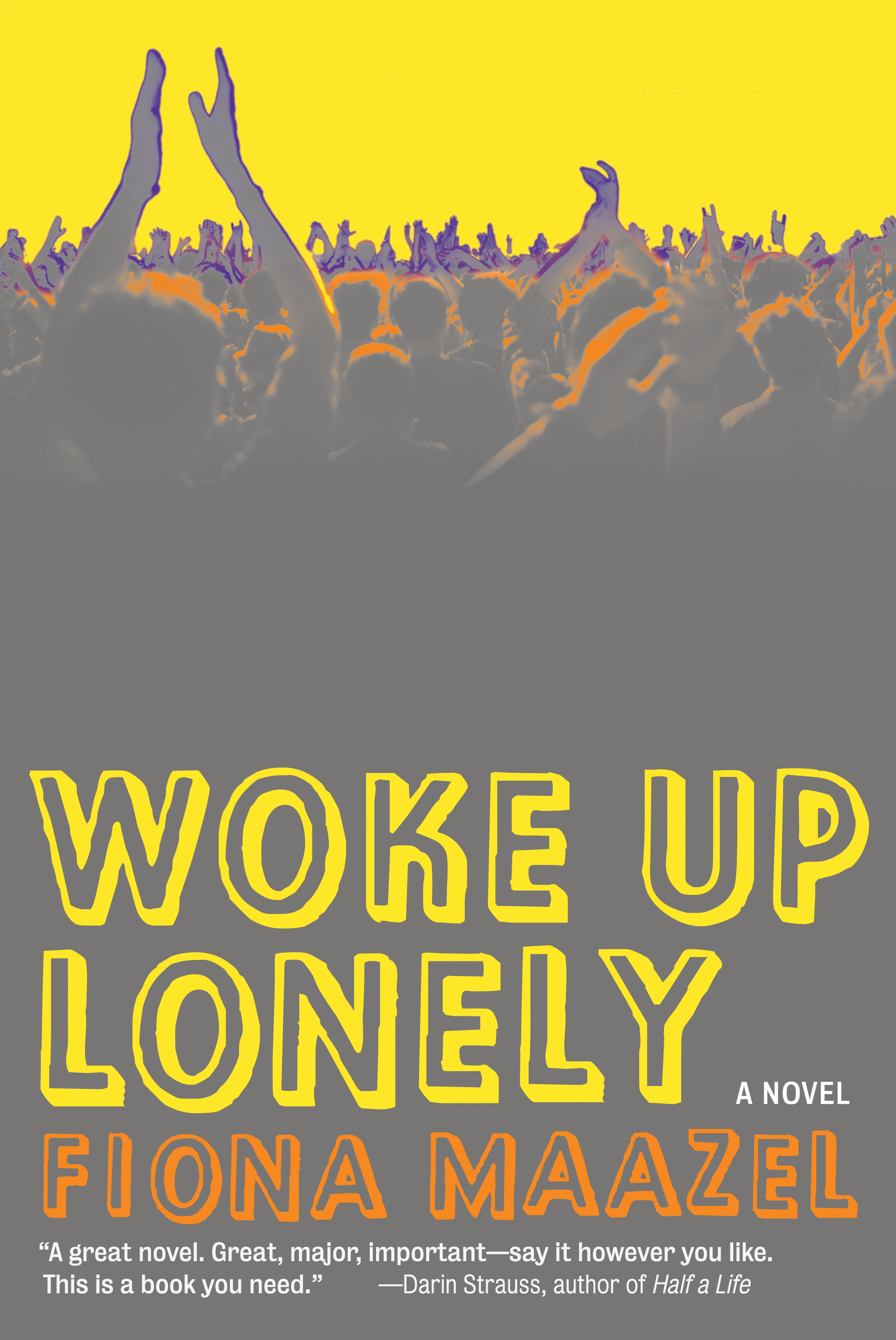
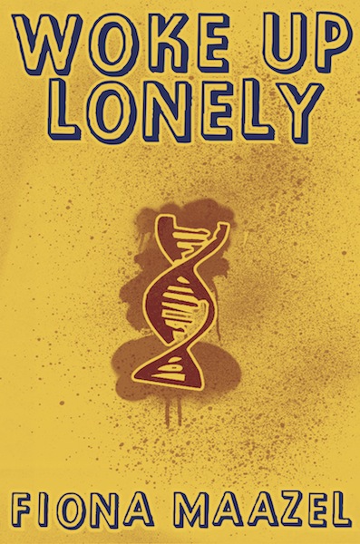
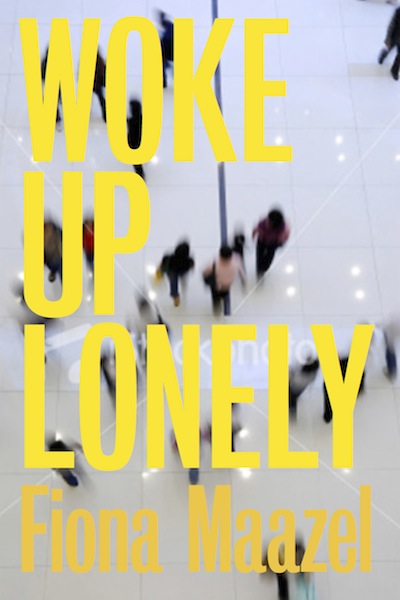
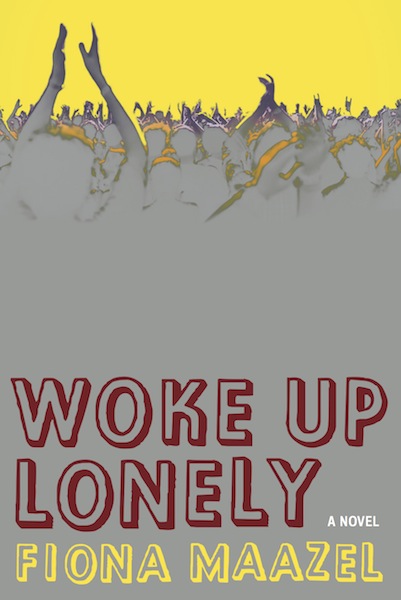
When I’m on the subway and I see someone at the end of the car reading a novel; when I want to know what that novel is but can’t make out the author name or title; when all the foregoing and yet I still know what that person is reading—that is my idea of a great cover. Which is to say: for Woke Up Lonely, I wanted something bold. Something that felt designed. No photographs. No birds. Nothing that telegraphed the title too explicitly (e.g. a woman crying in bed in the morning) and, above all, nothing girly.
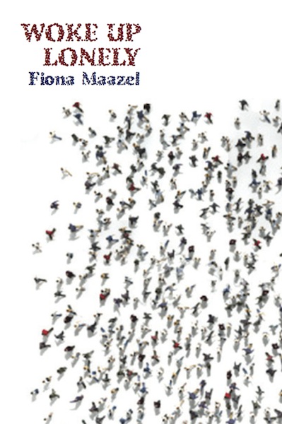
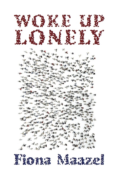
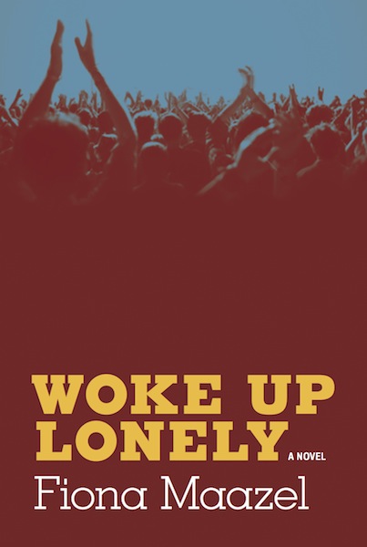
I’d envisioned a map of the United States overlaid with symbols of the Helix, which is the name of the cult that dominates the novel. That failing, I’d imagined something bright, something green. So when I saw early designs of this cover, they didn’t exactly jibe with what I’d had in mind, though I was instantly taken with Alvaro Villanueva’s notion of working with a crowd of people. Of course. Forget the map, what this book needed was a crowd—an enthusiastic crowd—to militate against the gloom of the title, which, if nothing else, does suggest one woman weeping in bed at dawn.
But that’s not what this novel is about. On the contrary, it’s about lots of people. Lots of people in various stages of exuberance and despair. So a cover that just conveyed despair was not going to do. The novel needed something that would capture its mania, which Alvaro’s color choices began to do, as well. An electric yellow. Orange and a hint of blue against a metallic gray. The color pallet alone seemed to represent the spectrum of emotions running through this novel.
Finally, there was the business of the font. I wanted something fun—nothing too heavy or static—but still big. And so we ended up with this 3-D font that’s a little messy and that almost looks as if it’s moving on the page, which felt destabilizing, and aptly so.
Now that the book is published, all I need is actually to find someone reading it on the subway because no matter where I am in the car, I’ll know it’s mine without question.
—Fiona Maazel, author
While working on another cover for Graywolf, [associate publisher] Katie Dublinski asked if I had time to add another one. It was something that already had a design, but it had not done well with the sales force, so they were rethinking it. She sent a brief description and asked if I had the time, and it worked out that I did.
The book was definitely my style. Fast, funny, many characters, lots of movement, modern, a little cynical, always personal and human. Sometimes it seems that everything Graywolf puts out suits my reading style, but when I think about it, I think Katie knows me and sends me just books that fit what I like. It makes it easier to like a book you’re trying to promote visually, after all.
Fiona sent me one or two e-mails with early hints about what mood she was hoping for, and Graywolf uses an author input questionnaire that she really gave thought to. In that questionnaire, she had some great comparison covers, showing she obviously cared and was paying attention.
I got the feeling she was aware of what I was doing via Katie, but that she didn’t want to interfere. Katie coordinated most of the communication so I was hearing about Fiona’s preferences and requests from her.
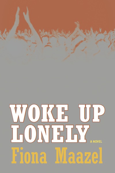
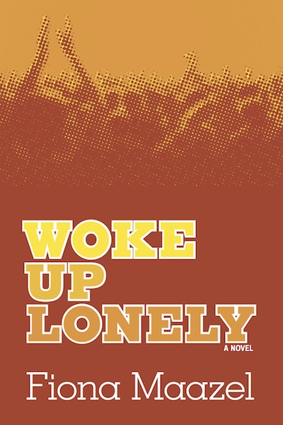
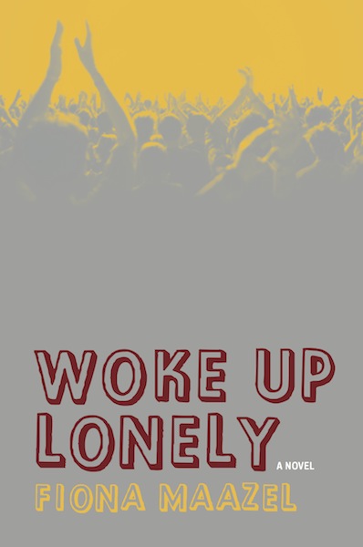
The images I played with the most in my comps had to do with crowds, and the facelessness of individuals in them, which if I dig in my memory I may have had an impression of Mao II’s section dividers in mind.

I don’t know if I can think of specific images from popular culture of the crowd versus star individual, but once I started playing with that I found it was easy to find or manipulate images that captured that feeling—so the feeling, this idea of individuals misunderstood or lost in a crowd, must be sort of simmering.
There were five or so ideas in the prototype stage and the first comps that I sent in. We didn’t pare down the various cover ideas immediately. That is, we tried options with a few of them before discarding ideas.
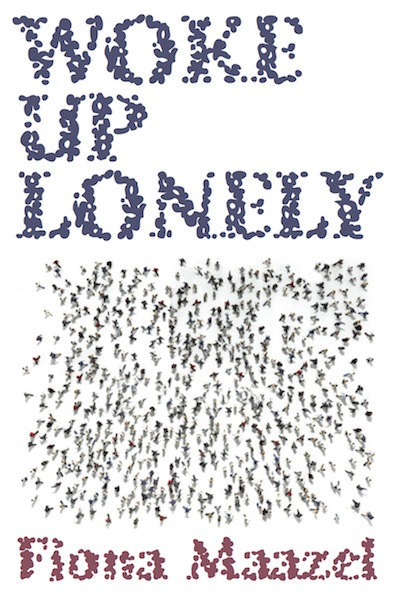
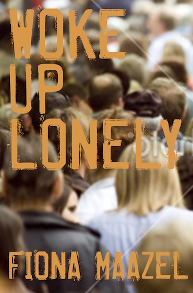
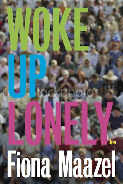
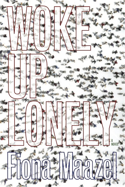
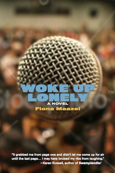
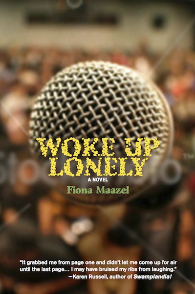
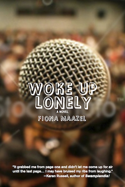
The comp with the microphone in focus really works for me, where it’s about the person on the stage not relating to the crowd. The one selected, too, though it’s from the opposite angle, where the distance between the crowd and the individual is this sort of blindness from what would be bright lights in the crowd’s eyes. On the one that made it through, the modifications had to do mostly with color and typeface—there were a few fonts that were close but not quite so we kept trying there—and later about materials. The composition never really changed on that one.
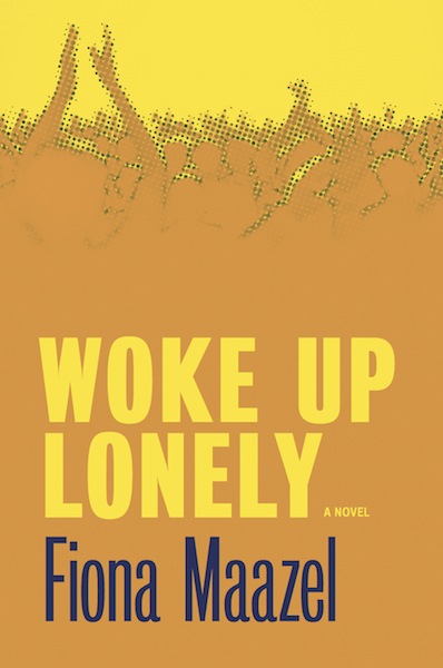
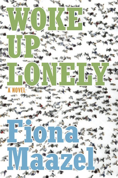
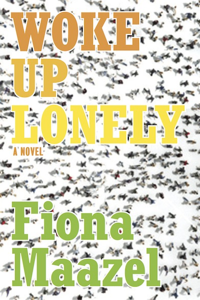
At some moment the thought came up, what if the resources were open so we could do anything we wanted, what would we do? If we could emboss or deboss, or try different materials, how could we reinforce any thematic idea on the cover? I wanted to convey that blindness the crowd must be feeling, so we thought about having a mirror effect on the cover, through metallic paper or a foil stamp. And we pursued that, researching other covers to see specific printing methods on specific materials, and we ended up liking the idea of printing over foil on a section of the jacket covering the full front cover. But in a reversal of sorts, we’d leave the un-inked bottom area in the figures, where in natural light it’d be completely dark, and where the bright light would be coming from stage, it’d be yellow ink covering most if not all of the reflective quality. There was a gradient of black ink in the area above the type and finishing in the hands and heads of the figures, to give them less reflection and let the image be readable to the eye in the way that a full metallic negative isn’t. And it looked good, and we sent that to print.
But the test print came back and it wasn’t working. I never got to see this test print, but I relied on Katie’s eyes and description to understand that basically the yellow ink was not doing its job of covering anything, and what we were getting was a dull greenish tint on metallic everywhere and the figures were not discernable. So we quickly made a couple of variations of the file and a few decisions about materials to look for alternatives. We were definitely getting away from printing on foil, so first we had to decide whether to print the foil as a stamp in all the areas not covered by ink, and let the ink cover paper, but the detail in the image itself made that unlikely to succeed and we didn’t have time to test it. So it came down to omitting foil entirely and printing that area with ink. The only question was whether it’d be gray ink or metallic. Luckily metallic was possible and that’s what we did.
I was happily surprised by the result. The metallic Pantone works very well to give it a depth, physical and visual, especially around the purples, that I didn’t expect. Not sure that it added anything thematically to the image, but it feels very satisfying. Not to mention it was a huge relief seeing it firsthand, given the issues we’d tried to solve that I hadn’t seen firsthand.
You can see in many of the comps the istock watermark. I made the graphic for the stencil, but for this book it seems I went through a lot of stock photo options. Or, there were so many available that it was easy to try them. Loneliness/individuality in a crowd is probably a trope. In a couple of cases, taking the images out of focus or burning out some areas heightened the effect. In the image for the final, I didn’t have to do much. It was black and white photo of a concert. It was pretty contrasty already, which I nudged along a little, tried different colors. Then I just had to figure out the printing process.
For the one that printed on foil, I started from a file with just black information on the top layer, and I colored the layers behind it. Then I knocked out all the black info and different parts of the colored layers so that it basically turned into a negative image, printing just CMY, no K, on foil. For the Pantone metallic/CMYK cover we printed, the Pantone plate is all in a bitmap TIFF placed on top of that same knocked-out and back-colored CMY file. And I had to do the trapping myself on that one because we were in emergency mode and the person who usually does that where we were printing was on a scheduled vacation. So I went for it. It was an educated guess on my part, and I got no second chances to adjust from proof because we were already on our second chance. On the covers I’ve seen, it worked. I hope it’s true of the whole run.
—Alvaro Villanueva, designer

Very nice those!