
(Grand Central Publishing, 2012)
I’ve had my ups and downs with my book covers in the past. Mostly downs, to be frank. I heard another author joking recently about how grateful she was that her book cover wasn’t some girl running through a field of wheat, and I was like, wait, that was actually my last book cover. I’m the joke! Ha, ha, ha. Hilarious.

But still, I had high hopes for The Middlesteins. I was with a new publisher, and my editor, the great and talented Helen Atsma, had promised me they would find a way to relaunch me. No wheat fields allowed. I believe she said no to a lot of designs before they actually nailed it. I ended up seeing the cover about two months later than originally expected. I was getting a little nervous. I tried not to nag. I’m sure I did.
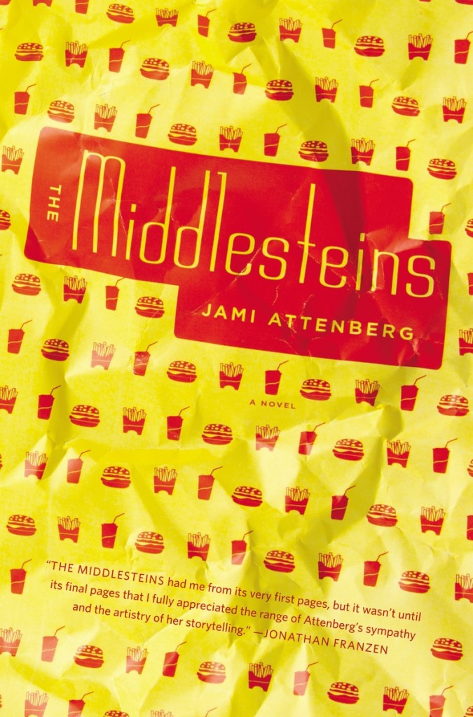
The original version I saw did not have the red box in the center. The title and my name were in red lettering over an open yellow space. I think there was some conversation around wanting to make the title and my name feel a little bolder, and they came back with the yellow lettering within the red box and then I fully fell in love with it.
I love, of course, how eye-catching it is. It makes you want to pick up the book, which is half the battle. It feels different and special, bold, possibly funny, possibly weird. It’s thematically appropriate without giving anything away. I like that the cover feels gender-neutral. And I also like that it sometimes makes people feel hungry.
I think Catherine is massively talented, and that this cover was an extremely important part of the success of this book. I’ve not met her in person, but based on the character and charm of this cover, I can only imagine I would like her very much. I’m really grateful to her.
—Jami Attenberg, author
When I heard editor Helen Atsma describe The Middlesteins at our initial launch meeting, I immediately wanted to design the cover. I have a real soft spot for novels with dysfunctional characters and love working on fresh fiction. I also though it would be an opportunity to push design-wise.
After reading the manuscript (which I loved!), I knew that I wanted something food-related on the cover. Food almost seems to have a magical power in the book—it pulls the family apart and also connects them to each other. There’s this great scene when the daughter-in-law is following Edie all over town as she goes through one drive-in after another. You can just picture the neon signs, the crinkly wrappers, and the plastic cups—all those great visual elements that surround fast food.
It took a lot of rounds to get to the final cover. All of the things I explored for the cover had some kind of food element ranging from silverware to cookies to people at a table.


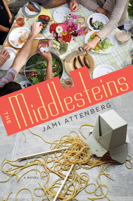
Jonathan Franzen‘s The Corrections had been mentioned as a comparative title, so I did a lot of designs featuring photos of families at dinner, but none of them seemed quite right.

The fast food wrapper that ended up being the cover was something that I initially created as a secondary element—a colorful patterned panel working alongside a photograph of a family. However, the design just felt too cluttered.

Everyone liked the wrapper, though, and at some point the idea of having people on the cover got abandoned and I started working up designs where the whole cover was the wrapper. I wanted to make the title look like a fast-food logo, so I picked a typeface that had a McDonald’s-looking M.
I created the food wrapper in Adobe Illustrator, printed it out, crumpled it up, and then photographed it including napkins and paper plates for the back and flaps.
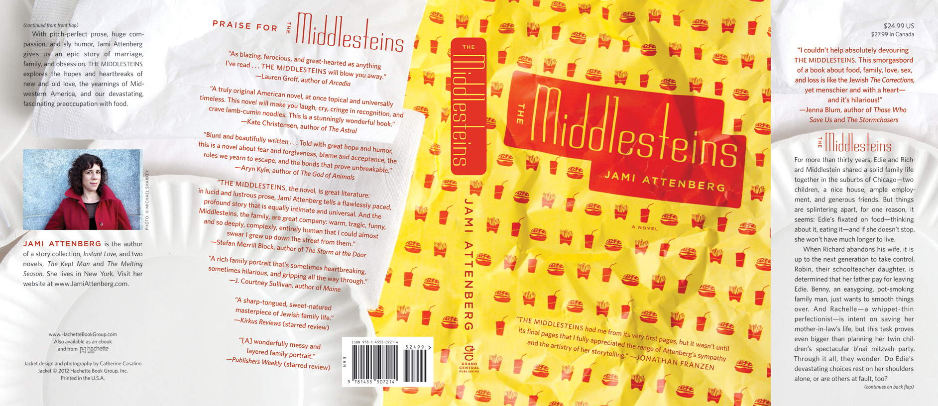
I have a background in photography, so I love creating original art when I can. Photographing the wrapper gave the whole cover a three-dimensional look, and I thought the bright colors would catch the eye whether you were coming across the book in a store or online.
I was really grateful that everyone in house was willing to go with a more graphic treatment as opposed to something that directly illustrated the characters in the book. When Helen shared the cover with Jami, she wrote back “LOVE IT!!! WANNA MARRY IT!!!” which totally made my day.
—Catherine Casalino, designer

Love this cover, it is perfect for the book. Great work!!
Loved it! Congrats!
I love the cover 🙂
That cover was one of the best from last year. It totally made you wanna pick up the book. Great design.
Thanks for sharing the process.